RebelRoots Hot Sauce | Branding & Packaging Design
RebelRoots Hot Sauce
Project Brief: RebelRoots Hot Sauce was born from a desire to challenge the ordinary and disrupt the hot sauce industry with bold flavours, intense heat, and a rebellious spirit. The brand celebrates individuality and self-expression, offering a unique experience to those who dare to break the mould. Rooted in sustainability and environmental responsibility, RebelRoots is more than just a condiment—it's a movement for change, blending passion, creativity, and purpose in every bottle.
Solution: For this conceptual project, I developed a bold and dynamic brand identity for RebelRoots Hot Sauce. Through impactful packaging design and marketing materials, I captured the brand’s rebellious ethos and commitment to sustainability. Each design element reflects the fusion of intense heat, unexpected flavours, and a mission for positive change, creating a cohesive and distinctive brand experience that resonates with its audience.
Services: Brand Naming, Brand Identity, Print & Packaging Design
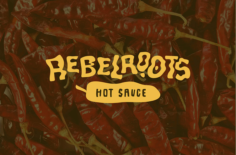
Logo Concept: The RebelRoots logo is custom-designed with each letter manipulated to create a loose, wavy, and imperfect look, mimicking the effect of hot sauce squeezed directly from a bottle. This playful and dynamic design represents the brand's edgy and rebellious spirit. A chilli icon beneath the text reinforces the brand's focus on bold, fiery flavours, clearly signalling that RebelRoots is all about hot sauce.
Colour Palette: The colour palette includes bold shades of yellow, light green, orange, red, and brown, each representing a unique flavour in the hot sauce collection. These vibrant colours are not only eye-catching but also evoke the fiery, rebellious energy of the brand. They are designed to reflect the heat and intensity of the sauces while also grabbing attention on the shelf.
Icons / Illustrations: The brand kit for RebelRoots includes custom hand-drawn illustrations of fire, two chillies, a sliced chilli, and a fist in the air, symbolising the heat, flavour, and rebellious nature of the brand. These elements reinforce the hot sauce identity while embracing the bold, unapologetic values of the brand.
Label Design: The label design includes a custom bottle label, branded stickers, a submark, and a pattern for the bottle cap. Heat level indicators are prominently featured to inform customers of the spice intensity at a glance. The overall label is bold, energetic, and reflects the spirit of individuality and rebellion that RebelRoots stands for.
Packaging Design: Packaging covers a range of products, including bottles, sauce sachets, box packaging, and mailer boxes with custom tape. The packaging design continues the brand’s dynamic visual language, making it immediately recognisable and reinforcing the rebellious, bold personality of RebelRoots. The designs are functional but visually exciting, offering a memorable unboxing experience.
Branded Merch: Merchandise such as fridge magnets, caps, and wristbands is designed to foster a sense of community among customers, allowing them to proudly showcase their love for RebelRoots and its fiery sauces. The merch is a fun, accessible way for fans to feel connected to the brand and its values of boldness and individuality.


