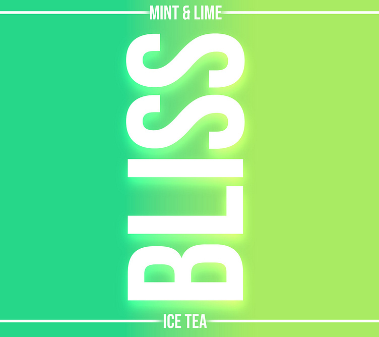
Bliss Ice Tea
Thought Process
Bliss Ice Tea
In creating Bliss Ice Tea and its packaging, my thought process was centered around conveying freshness, vibrancy, and a sense of relaxation. The choice of mint and lime green colors was deliberate—mint symbolizes coolness and calm, while lime green evokes zest, energy, and a refreshing feeling. Together, these colors create a visually appealing and inviting look that aligns with the product’s essence: a refreshing and uplifting beverage experience. The goal was to make Bliss Ice Tea not just a drink but an invigorating moment of bliss, perfectly captured in its vibrant packaging.
More by Gen X Digital View profile
Like

