Data Visualization Graph 📊
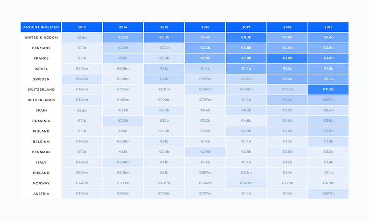
I designed this data visualization with color-coded highlights to make trends easy to spot and compare.
Here are the UX focus points:
✔️ Uses color to highlight trends—darker shades to emphasize higher values
✔️ Keeps key elements, like country names and years, sticky for easy navigation
✔️ Maintains consistent formatting for quick comparison across categories
If you need help with you next design project, feel free to drop me a line 💬