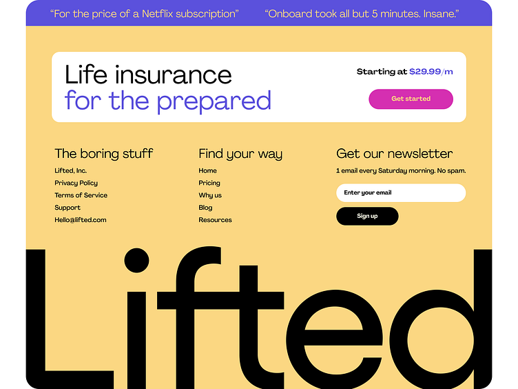
Full Screen Footer
Why a Full-Screen Footer is the Ultimate Power Move for Your Website
Think of your website footer like the perfect pair of shoes. It may come last, but it’s what completes the entire experience. A full-screen footer is sleek, bold, and purposeful—anchoring your page with confidence. It’s the last thing your visitor sees, and your final opportunity to build trust, inspire action, and leave a lasting impression.
With a spacious, full-screen design, you're empowering your users with intuitive navigation, making it effortless for them to access key information. Whether it’s seamless access to contact details, social media links, or a clear call-to-action, this smart design keeps your audience connected and engaged without any friction.
Don’t underestimate the power of a well-crafted footer. It’s more than just the end of the page—it’s your final chance to captivate, convert, and inspire. Make it count.
