Logo design for productivity startup
Meeting Canary is a versatile and reliable product that is designed to meet the needs of its users. Whether you're looking for convenience, functionality, or simply a high-quality product, this is the perfect choice for you.
I was tasked with redesigning the logo and wordmark to best fit Mike's vision for Meeting Canary.
For Mike @ Meeting Canary, 2021
Brand attributes
1. Playful – project management is boring, kinda want to be a bit less dull
2. Lean – light footprint, big impact. The metaphor is that the organizer uses Canary to help them punch above their weight class, but the tool itself is simple and down to earth. Not JIRA or something.
3. Clarity – in the end, the point is to clarify communication between people
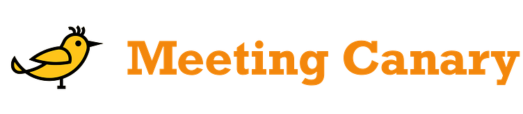
Before:
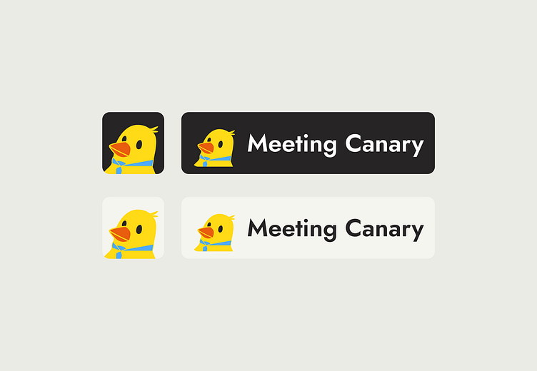
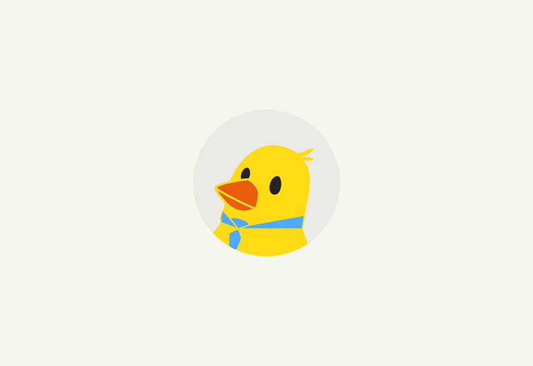
After: