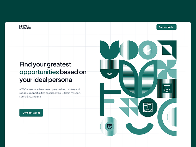
Facedancer Landing Page
Facedancer Landing Page Design - A Seamless Blend of Innovation and User Engagement
As the Head of Design for the Pattern team, I crafted the Facedancer landing page to showcase our brand’s innovative spirit while providing a user-friendly experience. The design strategically balances aesthetics and functionality, ensuring that visitors are both visually captivated and effortlessly guided through the content. The layout emphasizes clarity and flow, with dynamic visuals and intuitive navigation that reflect the forward-thinking energy of Facedancer. Every design element, from typography to color scheme, is thoughtfully chosen to create an engaging, memorable journey for users, embodying the essence of our brand’s vision and values.
This version highlights the overall landing page design and its focus on innovation, user experience, and brand identity.
