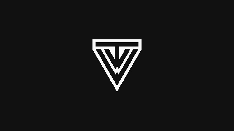
"TVW" Logo
This logo was a fun challenge. Rather than using a standard font, I crafted different angles to create the design. I wanted the "V" and "W" to be similar yet distinct, so I scaled the "V" down and fit it into the bottom of the "T." This subtle detail might not be immediately apparent, which was my intention. The "W" is larger and sits at the bottom, connecting to the "T" on top. The merging of these letters results in a simple yet unique logo mark.
More by Jonah Welsh View profile
Like
