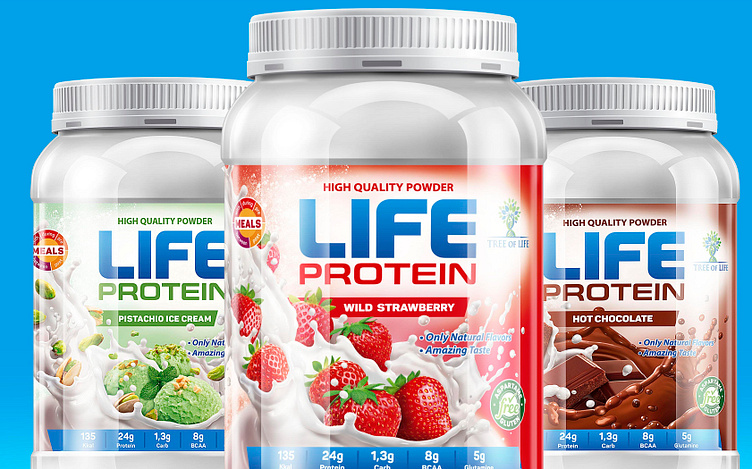
Life protein packaging design
THE TASK
Tree of Life is a line of powdered protein-rich foods for active people or those doing sport intensively. Our task was to create a trademark and packaging designs for the whole product line. The design had to be dynamic with a clearly defined product illustration and distinct color coding for each product packaging.
THE SOLUTION
After a careful analysis of this product type, our conclusion was that most packaging was not typical of the food industry. The protein bar taste is shown simplistically and the design mainly exploits a multitude of field lines.
In this particular case, our client's product line comprised a large variety of tastes, and so called for a product illustration. Furthermore, this would have guaranteed that the product would stand out from those with the stereotypical packaging.
In search for the optimal composition, we created several sketches, so that in the end we would have a large readable product name and a dynamic product illustration, which showcased the kind and taste of the product.
We put a label reminiscent of the powdery essence of the product under the name. This powder slowly transitions into liquid to the left.
We put the most important product information in a chart and crated pictograms to present it in a better way. We made sure this information was visible, as it is essential for this group of consumers.
As this was a large product line, the colors which made the difference between products had to be carefully selected


