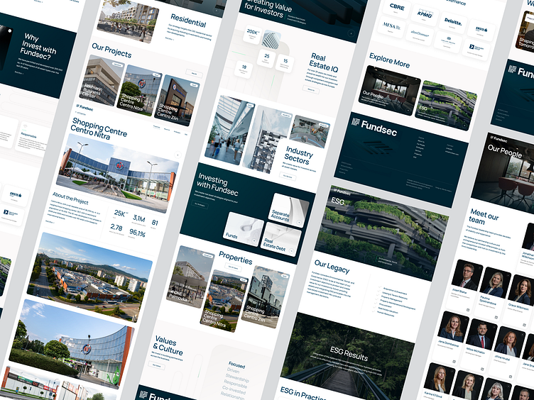
Minimalist Design for Real Estate with 3D
The Fundsec website refresh aimed to create a visually stunning yet streamlined platform, intentionally avoiding unnecessary complexity. Our objective was to transform the traditionally static real estate sector by introducing interactive elements, including 3D features, dynamic videos, and animated logos, to bring a fresh and engaging experience to the user.
To maintain focus on what truly matters, we created clear wireframes that ensured a minimalist design was followed from the initial blueprint to the final product.
Our approach centered on delivering a design that seamlessly aligns with the brand’s ethos, ensuring a natural and authentic respect for Fundsec’s identity.
We teamed up with photographer Martin Kabát to create custom, purposefully shot images that captured the essence of real estate in an authentic way. These photographs played a key role in shaping the website’s distinct visual identity, adding a layer of realism that sets it apart.
The design process emphasized creating an attractive layout through strategic use of visual elements, focusing on simplicity and user intuition.
We are a digital product studio Wonder Makers 🔗, follow us on Instagram 🔗, and find more inspirational content through our Linktree 🔗.


