JOJO-Candy Factory Illustration
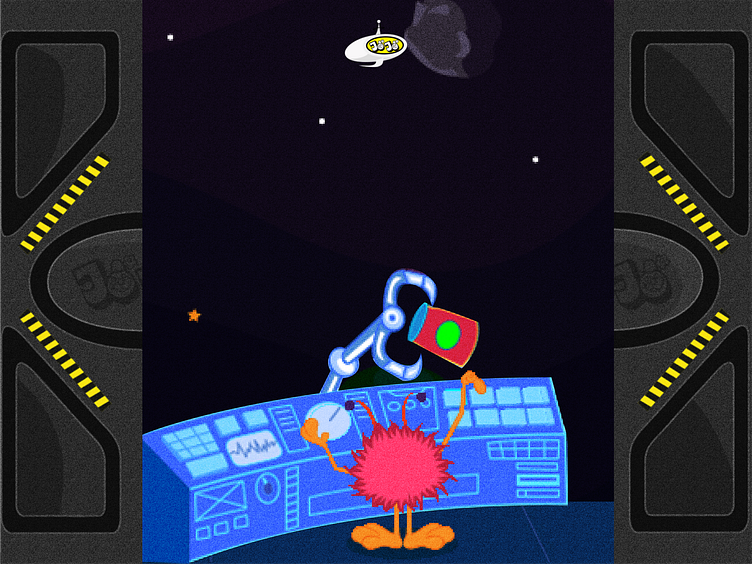
For JOJO candy shop, the design focus was on creating a playful and visually engaging experience that appeals to both children and adults. The illustration concept centered around a whimsical world where candy comes to life, using vibrant colors like candy reds, bubblegum pinks, and mint greens to reflect the joyful nature of the brand.
Character Design: Playful mascots, such as animated gummy bears and lollipops with faces, were crafted to connect with younger audiences. These characters, each with a distinct personality, became key elements across various touchpoints, from packaging to digital interfaces.
Visual Storytelling: Illustrations served as narrative tools, guiding customers through the candy-buying journey, making it an immersive experience.
Application Across Media: Designed for versatility, the illustrations maintained their vibrancy across both digital and physical media, ensuring JOJO’s brand was instantly recognizable.
In summary, JOJO’s illustration design brought the brand to life, turning the candy-buying experience into a delightful adventure for all ages.
