Rais - Dashboard
Hello!
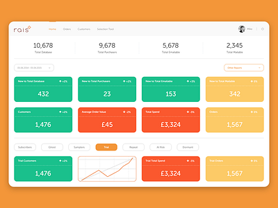
Today I'd like to present another shot of Rais project: dashboard main page.
Main purpose of this page is to help users quickly and easily determine if the KPIs increases in relation to the compared period.
Traffic lights are a good way of showing it. If the KPI increased then box is green, if it decreased then it’s red and if it stayed stable then yellow.
Also If a user point mouse over on one of the boxes, it shows a graph.
More by Michal Daniel View profile
Like

