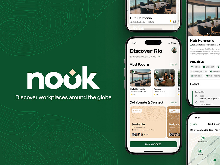
Case Study: Nook - Discovery Places
Every month, our team takes digital product ideas from concept to a fully designed experience within a limited time frame. In this case study, the team created Nook. The design challenge was to address the digital nomad's need for social connection and a stable work environment.
1: Discovery
1.1 UX Research
We reviewed YouTube videos of digital nomads sharing their tips and experiences to pick up insights into common challenges and solutions. We analysed reviews of co-working spaces, cafés, and co-working hostels across various cities, focusing on Wi-Fi quality, ambiance, noise levels, and suitability for remote work.
Additionally, we explored articles offering remote work tips in popular digital nomad regions like Cape Town, Europe, and South America, gaining valuable insights into best practices and must-have resources for working in different cultural contexts. We learnt that constant moving around can lead to feelings of loneliness and isolation. Some areas can be dangerous for remote workers traveling with equipment like laptops, since they might not know which locations are considered high risk.
It became clear that finding reliable and quiet workspaces conducive to online teaching or other remote work tasks was a significant factor.
1.2 Customer Identification
We identified that the typical digital nomad is a remote worker, highly tech-savvy, and values flexibility. They require a tool that supports their asynchronous lifestyle.
Our research led us to a consolidated user persona of remote workers who are keen to explore and travel while maintaining their productivity. Their problems highlight the challenges of travel, the unfamiliarity of new spaces, and the importance of finding suitable work environments.
1.3 User Journey Mapping
Finding a Nook
We centred the functionality of the app around the user needing to book their accommodation in a new city. Unfamiliar with this new space, the user would be making use of the app to discover nearby spaces to work, ultimately helping them decide where they should stay and plan their working logistics. A recurring challenge pointed out by nomads was the difficulty of building close friendships due to having a limited network in new spaces and trouble adjusting to different cultural environments. We found that feelings of loneliness and isolation were described as a significant con among digital nomads when sharing their experience of the lifestyle.
Building Connection
The insights found around loneliness and adapting to new environments informed the secondary core function of our app: the Collaborate & Connect section. This feature aims to bridge the social gap by connecting digital nomads with each other in unfamiliar places. By offering social and community-building activities, the app helps users find like-minded individuals and build a support network.
2: Branding
2.1 The Name: Nook
The app helps users find and connect with unfamiliar spaces, which perfectly reflects the idea of discovering a personal, welcoming spot wherever they go. This is why we chose "Nook" as the name for our app. It captures the essence of a cosy, productive space—a small, private area that provides comfort and calm, much like a nomad finding a peaceful haven in the midst of their travels.
2.2 Look & Feel
The colour palette for Nook was chosen to evoke a sense of adventure, groundedness, and exploration, reminiscent of rocky canyons and forests. Graphic patterns were directly inspired by topography lines of mountains, supporting this spirit of adventure. By drawing from natural landscapes, the design style aims to create a comforting and familiar environment for digital nomads, emphasising both productivity and a connection to nature through dark green, earthy brown, and warm neutrals.
3: User Interface Design
3.1 Design Process
Each team member focused on different parts of the app—the home page, map page, and Nook detail screens. The branding was dissected to transform the app journey's main functions into a cohesive landing page that flows into a map view with detailed work spot information. The UI design was inspired by Airbnb's map interface for identifying nearby work spots and AllTrails' user-friendly card-based layout for the home page. Decisions about UI elements, layout, and interaction design were made collaboratively. Each team member worked on their respective screens and then came together to discuss and provide feedback during the design phase, ensuring that every design choice aligned with our collective vision.
3.2 The Solution
We designed the app interface to allow users to locate nearby work-friendly spaces relative to their accommodation, aiding in travel logistics. Reviews and ratings help users make informed choices based on Wi-Fi quality, noise levels, and ambiance. By highlighting reliable and safe workspaces, the app helps users avoid high-risk areas with reviews from other nomads sharing their experiences ensuring secure working environments and reducing the stress associated with constant travel. The Collaborate & Connect section fosters social connections through community-building activities and events, addressing the isolation common among digital nomads. Additionally, the app aids in planning logistics, simplifying the process of settling into new locations and providing valuable insights into the best places to stay and work.


