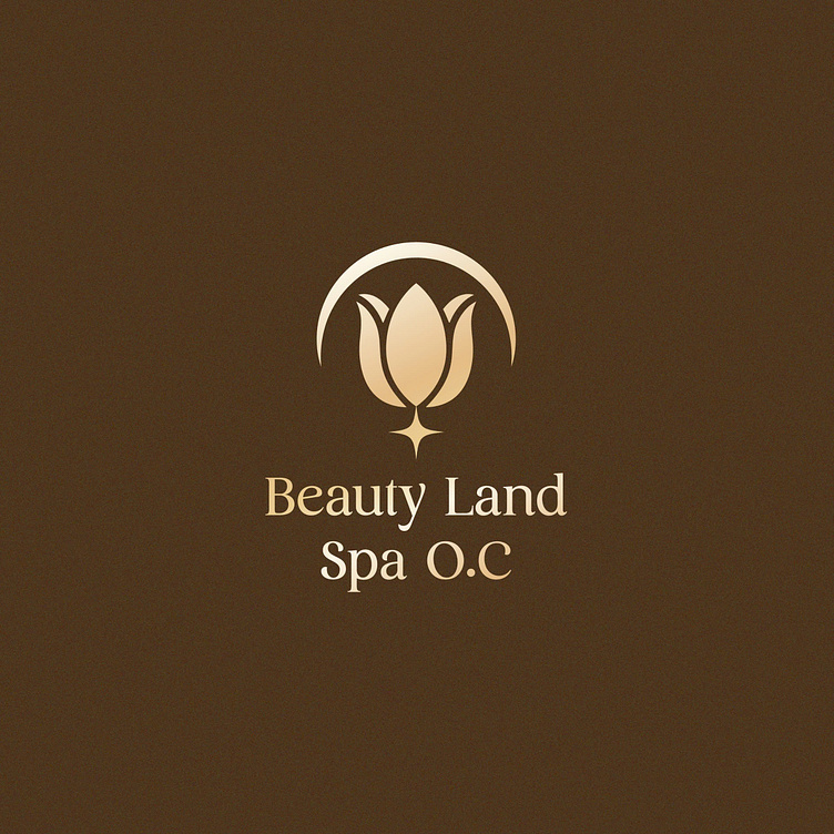
BEAUTY LAND SPA | LOGO DESIGN & BRAND IDENTITY
Beauty Land Spa was born with the mission of bringing customers the ultimate relaxation and beauty care experiences. Each service at Beauty Land Spa is personalized to suit each customer, from skin care, massage to intensive treatments.
The Beauty Land Spa brand identity designed by Bee Art uses two main color tones: brown and gold, representing luxury and warmth. Brown represents trust and stability while gold represents luxury, sophistication and elegance. This combination clearly conveys the core values of the brand, bringing a sense of relaxation and class to customers at first sight.
The Beauty Land Spa logo is designed using the tulip symbol as the main symbol representing beauty and purity, suitable for the brand's beauty spa field. In addition, the logo is also designed with an arc symbol above the tulip flower representing the radiant beauty of a girl. Overall, it creates a sophisticated, elegant logo that still conveys the brand's message.
--
Designed by Bee Art
-
Client Beauty Land Spa
Logo and Branding Project. Logo is designed for Beauty Spa in Vietnam.
Copyright © Bee Art. All Right Reserved
Contact us:
• Hotline/ Zalo: (+84) 77 34567 18
• Email: info@beeart.vn
• Website: www.beeart.vn
• Facebook: https://www.facebook.com/BeeArt.vn


