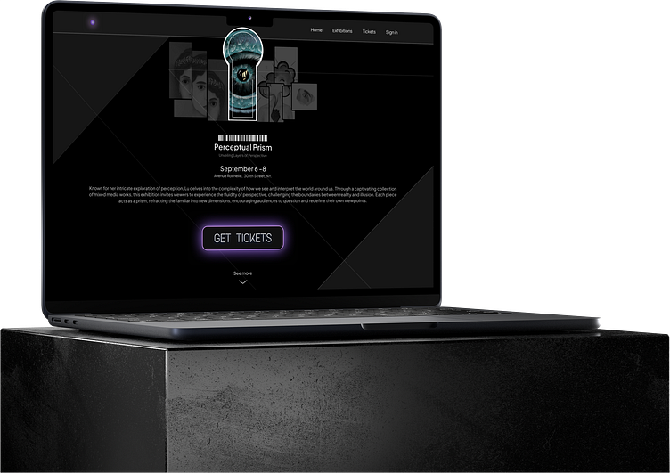
Landing page
🚀 UI Challenge #3: Create a Landing Page Design for an Art Exhibition Design
The concept was to blend minimalism with sophistication, reflecting the essence of contemporary art. The goal was to evoke a sense of intrigue and elegance while ensuring that the design remained clean and user-friendly.
The contrast between the dark background and neon accents created visual interest and emphasized key actions, making navigation seamless and intuitive.
The design is intentionally minimalistic, avoiding unnecessary clutter to keep the user’s attention on the artwork. Each element is purposefully placed to enhance the overall flow, ensuring a cohesive and engaging experience.
Drop your feedback in the comments.
#DailyUI
More by Silu View profile
Like

