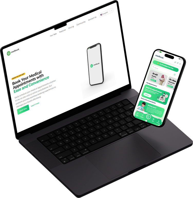
Medibook UI/UX and Web Design: Landing Page
Project Overview: Medibook is a comprehensive web platform created to revolutionize the way medical appointments are managed and scheduled. The project was conceived with the goal of making healthcare more accessible and user-friendly, both for patients seeking care and for healthcare providers managing their appointments. My role involved crafting the entire UI/UX design for the platform, from concept to final implementation.
Design Philosophy: The core philosophy behind Medibook’s design was to create a seamless and intuitive user experience that minimizes the friction often associated with booking medical appointments. By focusing on clarity, ease of use, and accessibility, I aimed to deliver a platform that users can navigate effortlessly, whether they are tech-savvy or not.
Key Features and Design Elements:
User-Centric Interface:
The interface is designed to be clean, intuitive, and free from clutter. I employed a minimalist approach to ensure that users can focus on the task at hand—booking an appointment—without unnecessary distractions.
Responsive Design:
Medibook is fully responsive, ensuring that users enjoy a consistent experience across all devices, whether they are using a desktop, tablet, or smartphone. This adaptability is crucial for reaching a wide audience and providing convenience on the go.
Interactive Booking System:
At the heart of Medibook is an interactive and user-friendly booking system. Users can easily search for healthcare providers, view their availability on a calendar, and book appointments with just a few clicks. The system also sends automated reminders and confirmations, reducing the chances of missed appointments.
Advanced Search and Filter Options:
To enhance usability, I incorporated advanced search and filtering options, allowing users to find healthcare providers based on specialty, location, and availability. This feature ensures that users can quickly locate the right provider for their needs.
Calm and Trustworthy Aesthetic:
The visual design of Medibook employs a calming color palette and modern typography. This not only helps to reduce user anxiety—common when dealing with healthcare matters—but also builds trust in the platform. The overall aesthetic is professional yet approachable, striking a balance that appeals to a broad audience.
Provider Management Dashboard:
For healthcare providers, I designed a dedicated dashboard that allows them to manage their appointments, patient information, and schedules efficiently. The dashboard is tailored to meet the specific needs of healthcare professionals, making it an indispensable tool for their daily operations.
Outcomes and Impact:
Enhanced User Engagement: The intuitive design and streamlined booking process have led to increased user engagement, with more patients comfortably booking their appointments online.
Improved Accessibility: By offering a responsive design, Medibook has made healthcare more accessible to users regardless of their device, ensuring that they can manage their health anytime, anywhere.
Operational Efficiency for Providers: Healthcare providers benefit from an organized and easy-to-use platform that simplifies appointment management, allowing them to focus more on patient care.
Challenges and Solutions: During the development of Medibook, one of the key challenges was ensuring that the platform could handle a diverse user base with varying levels of technical proficiency. To address this, I conducted extensive user research and testing, iterating on the design based on feedback to ensure that the final product was as user-friendly as possible.
Future Enhancements: Looking forward, Medibook has the potential to integrate additional features such as telemedicine consultations, personalized health dashboards, and integration with electronic health records (EHR) systems, further enhancing its utility for both patients and providers.
Explore the Design: If you’d like to dive deeper into the Medibook project and see the design in action, you can explore the full prototype on Figma:
or the landing page :
This detailed description provides potential viewers with a comprehensive understanding of the Medibook project, including its design philosophy, key features, and the impact it aims to achieve.
