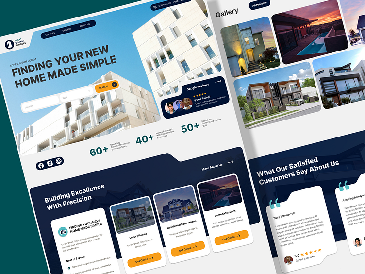
Construction Company Homepage Design
Hello Everyone !
I am excited to share with you the first of the few designs I have just made recently. I came across a construction company’s website and thought it would be fun to recreate its homepage. I refined the sections and rearranged them to instantly showcase the company's credibility while providing visitors with a smoother interface.
Please enjoy!
How I Designed Each Section
As you can see, there are 5 main sections of the homepage. Each providing different functions that help give the website a good feel of what the company is about.
========================================================
Above the Fold
Better Image - replaced the old one with an actual real building instead of a mock image
Trust Signals - the company boasts 5 star reviews but not actually taking advantage of it. So I added it up here to showcase how highly reputable their company is.
Contact Us Number - it is shown right away.
Company Stats - I think one of the biggest things to showcase if you are a highly reputable company is to let people see your accomplishments right away. hence why I added the number of homes built, enhanced, etc.
Services Section
Short Summary - I provided a short summary of what the services entails and what is expected of these services by adding at least 3 bullet points for a checklist.
More Descriptive - Each Service Card now has short descriptions and a button
About Us link - if they are curious with the team behind these services they can click on the link on the far top right corner of the section.
Gallery Section
Less Pictures - Showing 20 pics right of the bat is not gonna do justice on what the company accomplished. I think posting the best rated pictures of each service will not overwhelm the visitor and let them focus on a few that highlights the capabilities of the company.
Adding a Filter - A big gallery requires a good filter. While at default it shows the highest rated pictures, giving the visitor the ability to navigate by other means is always a win.
Customer Reviews Section
Added Pictures - Old Section was just a big chunk of words for each customer review, so I added the names and pictures of those who gave the reviewer to give more life to it and let people know that the people who are posting this are actual real people.
Redid the Card Design - Just an easy improvement with the appropriate theme colors with cool open quote icons
Contact Us Section
Phone Number - showed the phone number right away with copy option if you click it.
Location Address - In case people are looking for it, adding in the address away is always a good option. It should also have the ability to immediately take you to google maps and pin the location once you click the card.
Newsletter - This is something to fill in the gaps mostly just a placeholder, but it would be a good section to provide an ad of some sort that relates with website.
I hope you liked my Presentation!
I enjoy cleaning up websites that need some thorough improvements on their current design. I aim to not only make it look good, but also make it function better to give people a better experience when visiting the site!
Drop a Like and Follow us!
Connect with me
rawparilla@gmail.com


