DayTask- App Screenshots Design
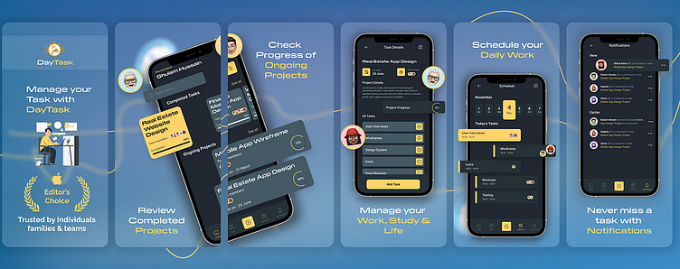
Eye-catching app screenshots are crucial for attracting users in app stores. I designed a series of informative and visually appealing screenshots for the DayTask app that showcase:
1. Review Completed Tasks: A screenshot depicting users reviewing and marking tasks as complete within the app's clear and organized interface.
2. Check Ongoing Tasks: A screenshot showcasing the ongoing tasks list, highlighting visual priority indicators for easy prioritization.
3. Manage Your Work, Study, and Life: A screenshot demonstrating the app's ability to manage tasks across different categories (work, study, personal) to promote a balanced lifestyle.
4. Schedule your Work: A screenshot showcasing the task scheduling functionality, including the ability to set deadlines and reminders for work-related tasks.
These screenshots effectively communicate the app's functionalities and my design approach, emphasizing clarity, user-friendliness, and a focus on productivity.
Do you have any upcoming app projects? I'd love to collaborate and help you design screenshots that:
Maximize downloads: By showcasing the app's most compelling features and user benefits.
Boost App Store Optimization (ASO): Using visuals that resonate with your target audience and relevant keywords.
Increase user engagement (A/B testing): Through strategic design elements and clear calls to action (A/B testing can further optimize these aspects).
Let me know if you're interested in discussing a project further. I'm happy to answer any questions you might have about app screenshot design or my process.
