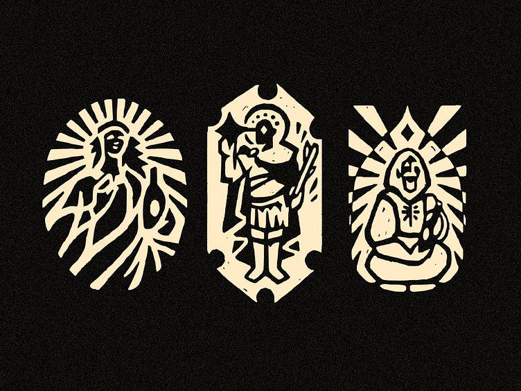
St. Jory (Winery) - Tryptic 3/4 ✦ Logo/Icon/Symbol
Tryptic 3 is here: in sharing the Logo Creation process for St. Jory Winery, I hope you’ve liked this progress so far, there is more nice sketches to finish this serie!
Since it is 12 of them, I decided to share this third tryptic as the first one, and the second one here. (we are almost there!)
I think the idea of representing a holy figure, or a saint, etc… isn’t used to be as a female (this may be the case, but not defined by that) protection to the winery fields, meets some kind of androgynous visual; I think of something really about caring, but in a more affective way, does it makes sense to you?
I tried my best to make it not too serious or too fun (despites the fact that this one looks like some rockstar or something) this case the idea was in the edge of what is a saint or maybe just a average artist, a man in a medieval fit…
I hope you loveed to follow my creative process, and please let me know in the comments if you are interested in knowing more details or anything about it.
Unfortunately, there is too much ChatGPT-ish comments on my posts, so it is great to know you are (human and) honestly interested in the project, so we can share more ideas! :)
BONUS… there is cool stuff in progress that soon (in 3 days!!!) I will share with you!
Something so amazing about learning, and how to tailor unique logos that I hope you may be keen to, I’m so excited.
Also, remember… I’m available for new projects :)
Full-time or Part-time Job, Freelance, Illustration, Graphic Design in general (of course, specially logos, typography, etc)
Don’t hesitate: get in touch by bitenquote@gmail.com
Feedback and suggestions are always appreciated!
Best,
BB


