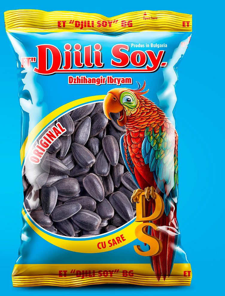
Djili Soy packaging design
The Task
„Djili Soy” is a Bulgarian company for the production and the packaging of nuts and seeds. Their products are sold both in Bulgaria and on the European market. Regardless of the good sales, our client knew that the design of their products needed to be refreshed and turned to us with the request to redesign the trademark and the character, as well as for a new design that would combine all series in a united concept. In time, after realizing this project, we developed a new product catalogue and stand. When designing the trademark, we knew that it was fundamental to keep it as close as possible to the original, but despite this we had to make the letters more modern and correct, as well as clearer from a geometrical point of view.
When it comes to the parrot, we decided to remake him with an entirely different technique, since the old one was presented by a flat vector illustration and it couldn’t reveal the beauty and colorfulness of this bird. We basically painted the character from scratch and we only kept its perspective. The letters DS, under the parrot used to look foreign, without any connection to the bird itself, so we attached them to a chain and in order for it to be convincing, we painted the legs as well. In this case, the redesign was significant but the occasion called for such an attitude, because despite the old project being familiar and popular among the consumers, it was seriously falling behind the rest of the competition on the shop shelf. In cases like this one, the old design was no longer capable of attracting new customers and it stops working as a marketing tool, leaving the product to depend only on the recognizable trademark. The design was used in several different series - a series of nuts with windows and closed packages for more expensive nuts. For each series we added different elements, which were typical for the specific line. For example, the parrot holds a beer mug, it has nuts in its beak or it resides in its natural habitat. In the series with a window we developed the composition harmoniously – the window is placed in such a way so that it fits in the package entirely and all text on the front is balanced so the focus is entirely on the optical center of the package


