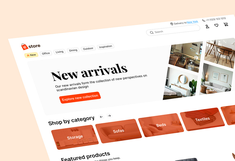
Responsive landing page for e-store
Hi! I made a nice-looking website's landing page for an online store using Figma. I used orange and gray colors to make it look good and easy to use. The orange color is bright and catches people's attention. The gray color makes it easy to read the text.
Do you like this project?
Let's create something amazing together.
Telegram: @QurbonovBobur
Fiverr: Ecommerce website
More by Bobur Qurbonov View profile
Like


