Redesigning KAI Access
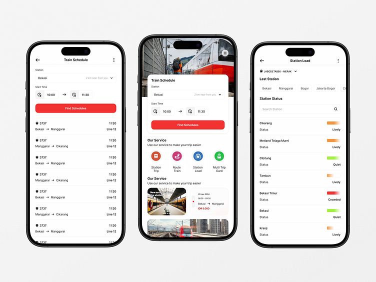
🚄 In redesigning KAI Access
focused on simplifying navigation and improving accessibility for users of all ages. Key pain points like complex navigation, buried features, and lack of crowd data were addressed by introducing a clean, intuitive layout and prioritizing the train schedule search as the main feature.
The result is a user-friendly, modern app that not only meets the needs of today’s travelers but also offers a seamless experience across all touchpoints.
Follow me
More by Tomi Fadilah View profile
Like

