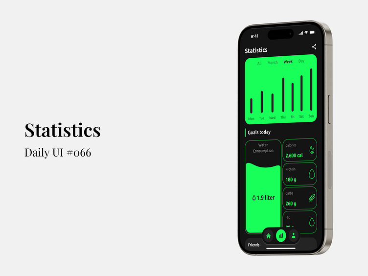
Statistics - Daily UI #066
🎨 Daily UI #066: Statistics
Tracking your progress shouldn’t be a hassle—it should be a visual experience! I’ve designed a statistics dashboard that balances minimalism with functionality, helping users keep tabs on their goals with ease.
💡 Key Features:
Interactive time filters (Day, Week, Month, All) for dynamic data visualization.
Simple, yet powerful progress indicators for water consumption, calories, protein, carbs, and fat.
Integrated social feature to stay motivated with friends' progress.
Designing this interface, I focused on user engagement through clean lines, vibrant colors, and an intuitive layout. This is more than just numbers—it's about making your health journey visually rewarding.
Curious about how this design could enhance your app’s UX? Let’s connect and discuss potential collaborations! 💬
Full Preview
Designing this interface, I focused on user engagement through clean lines, vibrant colors, and an intuitive layout. This is more than just numbers—it's about making your health journey visually rewarding.
Curious about how this design could enhance your app’s UX? Let’s connect and discuss potential collaborations! 💬
------------------------------------------------------------------------------------------------------------
Let's talk and Collaborate:

