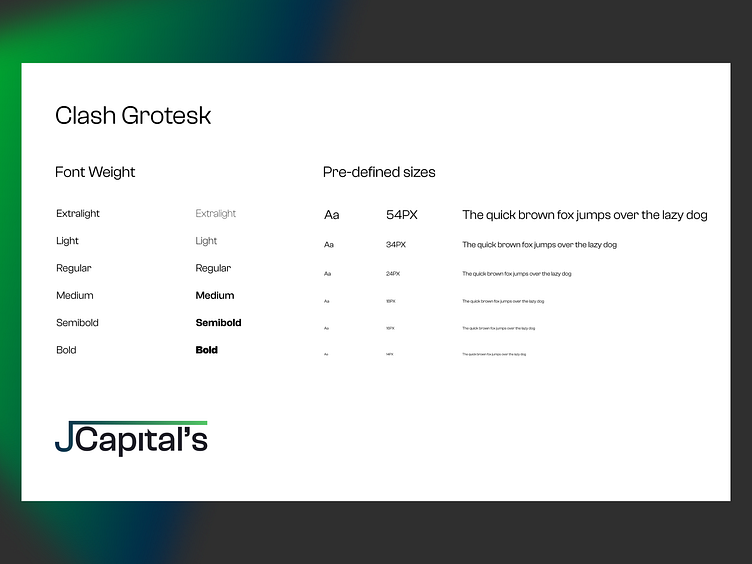
JCapitals-Typeface
The J Capital marketing page features a refined typography setup to enhance readability and convey professionalism:
1. Primary Typeface:
Sans-Serif Font: A clean, modern sans-serif font is used for headings and key text, providing a contemporary and approachable feel while ensuring clarity and readability.
2. Secondary Typeface:
Serif Font: A complementary serif font is used for subheadings and body text, adding a touch of traditional elegance and emphasizing the seriousness of legal services.
3. Typography Hierarchy:
Headings: Bold and larger font sizes to draw attention and establish a clear hierarchy, making it easy for users to scan and understand key information.
Body Text: Standard sizes and weights for easy reading, with ample line spacing to enhance legibility.
4. Consistent Styles:
Font Weights: Variations in font weight (e.g., regular, bold) are used to differentiate between headings, subheadings, and body text, creating a cohesive visual structure.
5. Text Colors:
Dark Gray or Black: High contrast for body text to ensure readability against lighter backgrounds, while maintaining a professional and clean look.
6. Accessibility:
Readability: The typography is designed with accessibility in mind, using clear, legible fonts and appropriate sizes to ensure content is easy to read for all users.
This typography approach for J Capital ensures a polished and professional appearance, enhancing user experience and effectively communicating the brand’s expertise in legal services.
