KELLS-Typography
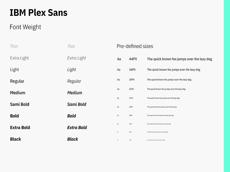
Primary Typeface: The main typeface is a clean, sans-serif font that ensures readability and conveys professionalism. Its modern design aligns with Kells' innovative approach to dental care.
Secondary Typeface: A serif font is used sparingly for headings, adding a touch of traditional elegance and creating a visual hierarchy that guides users' attention.
Typography Hierarchy: The structured use of font sizes and weights—bold for headings, light for body text—ensures clarity and ease of navigation across all devices.
Consistency and Accessibility: Kells maintains consistency in typography across all platforms, ensuring a cohesive brand experience. The fonts are chosen for accessibility, with high contrast for easy readability.
In summary, Kells’ typography combines clarity and trustworthiness, enhancing the user experience and reinforcing the brand’s commitment to dental health.
