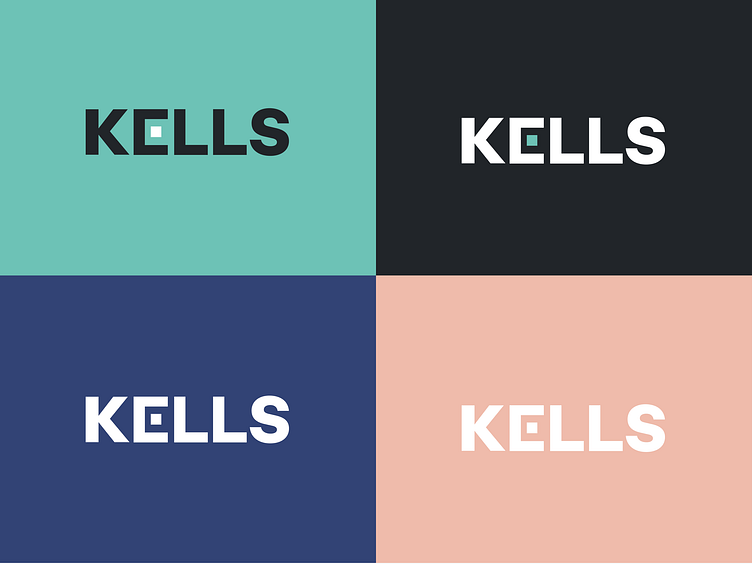
KELLS-Branding
Kells is a forward-thinking dental app that empowers users to stay ahead of cavities with predictive insights. Its branding reflects a commitment to innovation and proactive dental care.
Visual Identity: The logo features a tooth subtly intertwined with a predictive wave, symbolizing the app's core function. A calming blue and white color palette conveys cleanliness and trust.
Tone and Messaging: With a tone of empathy and expertise, Kells promotes the idea that "prevention is better than cure." Taglines like "Stay Ahead of Cavities" reinforce its value in proactive dental health.
User Experience: The app's intuitive design ensures accessibility for all ages, with smooth navigation and clear data visualizations, making dental health a routine, stress-free part of users' lives.
Brand Promise: Kells is a reliable partner in maintaining oral health, consistently delivering a message of innovation, care, and reliability across all touchpoints.
In essence, Kells is more than just an app; it's a brand that empowers users to protect their smiles with confidence and ease.
