28/32 – Tennessee Ramblers
On to the Next
Last but not least, here is the Central Division and East Conference's final team – the Tennessee Ramblers.
Up until recently, the Ramblers have never been a team to develop homegrown talent, often signing veteran players in the twilight years of their careers to provide a spark to a young team in need of direction. After a 6-10 finish in Season 26, the Ramblers would take a chance on an undrafted 4th-year quarterback. That move would cash in for a 12-4 record and #1 seed the following season, likely changing the trajectory of the team for the foreseeable future.


Visual Direction
This franchise began with a slew of mountain-themed nicknames based all over the Appalachians before ultimately settling down in Nashville, Tennessee.
As a state, Tennessee sees a wide range geographic diversity with rolling hills and wooded mountain rages on the Eastern border to the sprawling cities and the musical hub of Nashville on the Western end. The nickname "Ramblers" originates from the Allman Brothers' "Ramblin' Man", a song that describes the life of a drifting musician moving from one town to the next. The song was rumored to have been written during an off-day in Gatlinburg, Tennessee.
Execution
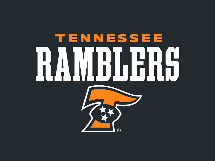
The Ramblers' primary logo depicts a "T" for "Tennessee" at an italic angle with the top bar of the "T" tapering in a flag-like motion as it moves from left to right. This reflects the "gone with the wind" lifestyles of a traveling musician as it is portrayed in the song's lyrics. Laid on top of the "T" is a football silhouette with the three stars from the state flag nested inside.
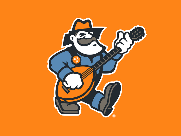
Tennessee's secondary logo illustrates a scruffy traveling musician, wearing a denim outfit with cowboy boots strumming a football-shaped guitar. The brim of the musician's hat loosely makes up the shape of Tennessee. On the rambler's right suspender is a pin with the stars from the state flag.
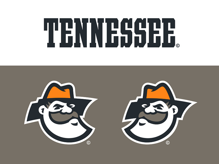
The partial logo for the Ramblers is a cropped version of the head from the secondary logo. This graphic has two versions, depending on if the man is facing left or right, that adjusts the state outline to always read in the correct orientation.
When it comes to the typography, this team uses a couple different styles for the team wordmarks. The most prominent design is based on a condesned saloon-style athletic block that spells out both "Tennessee" and "Ramblers" wordmark versions. There is also a wider sans with light serifs that mimics the signage of the Historic Tennessee Theatre blade sign, which is paired with the saloon-styled wordmark in the primary lock-up. Additionally, there is a "Ramblers" script that is built in the light of the primary logo's free-flowing nature.
Tennessee's jersey number set incorporates a traditional athletic block with a single outline and an attached drop shadow, which borrows from classic sign-painting techniques.
Road Warriors
As the Tennessee Ramblers look to step in to a new era of competitive football, they will do so equipped with a harmonious visual identity and rockin' logo suite for their upcoming campaign.
Football Helmet Mockup by SportsTemplates
____________________