rebranding lazy food
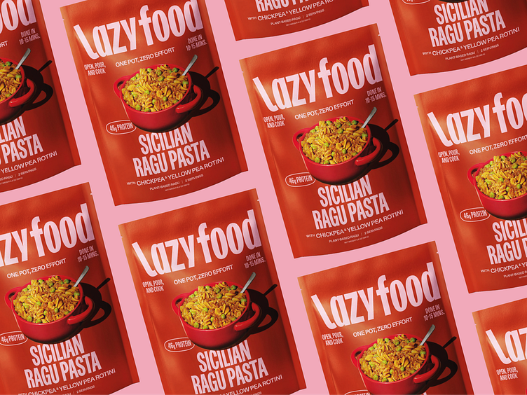
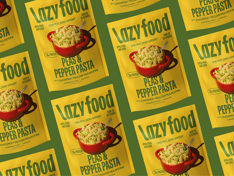
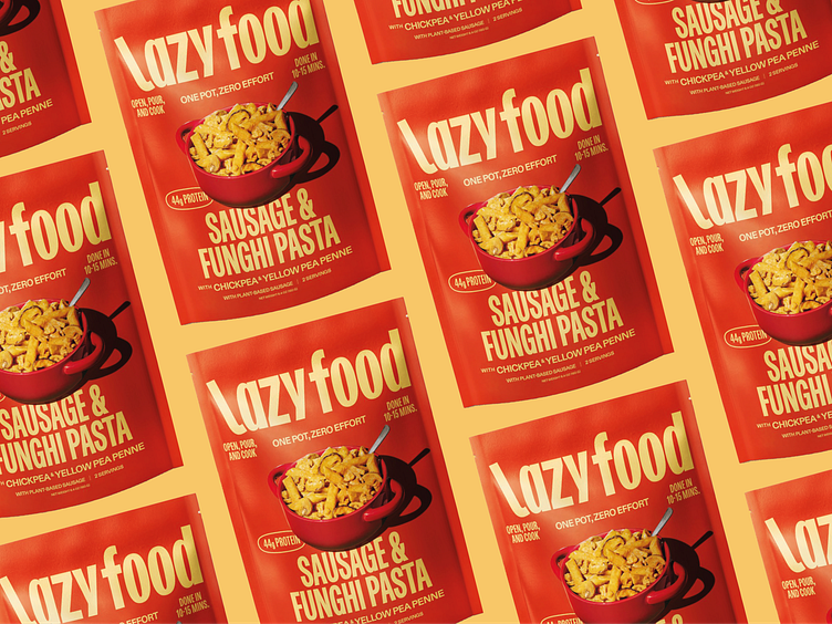
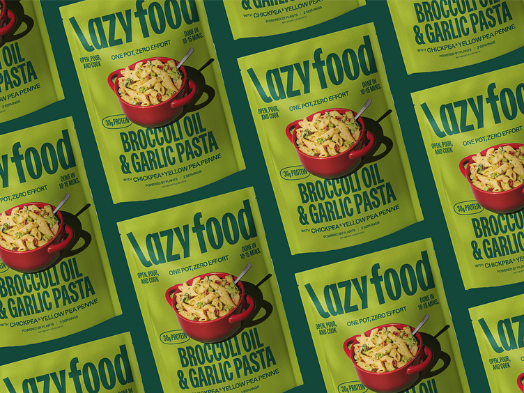
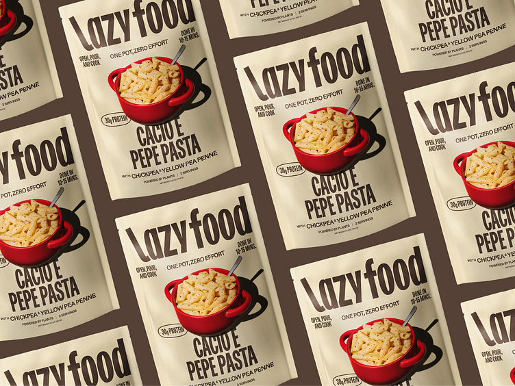
Lazy food got into retail and we did a rebrand to make the packaging "shelf-ready".
It keeps the main essence from the previous brand: big type and bold colors but it adds a picture of the product on the front.
For the picture we decided to the show the pasta in the pot instead of the usual plate as one of the main key point of the product is it's the quick and easy preparation and the fact that you need just one pot to make a chef-ready dish.
The choice of the colors come from the main ingredients of the dish.