PayIt Branding
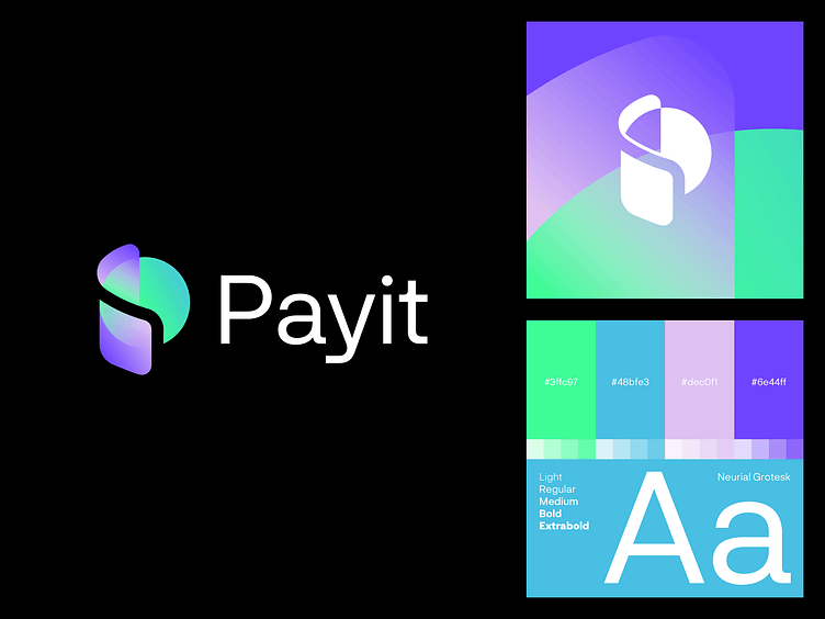
The PayIt logo design seamlessly blends the elements of a wallet and a coin, symbolizing digital transactions in a clean and modern way. The wallet represents security and ease of use, while the coin embodies the essence of financial transactions. The typography is minimal and modern, reflecting trust and accessibility, with subtle curves that give the logo a sleek, contemporary feel. green and purple shades, symbolizing both trust and innovation. The green conveys security and growth, while the purple adds a touch of creativity and sophistication. These colors, paired with the wallet and coin elements, create a modern and dynamic visual identity that stands out, representing a digital payment platform that is reliable, forward-thinking, and user-friendly. Overall, the design communicates a user-friendly, secure digital payment platform that is both innovative and approachable.
▪️logo for sale