Portfolio

Showcasing Creativity of Mine
Crafting a Modern UX/UI Portfolio
In the competitive world of UX/UI and product design, your portfolio is often the first impression you make on potential employers or clients. It’s not just a showcase of your skills; it’s a reflection of your design philosophy, your attention to detail, and your ability to communicate effectively through visual mediums. Nuthan Aradhya T J’s portfolio is a stellar example of how to merge creativity with professionalism, creating a memorable user experience that leaves a lasting impact.
1. The Power of Minimalism
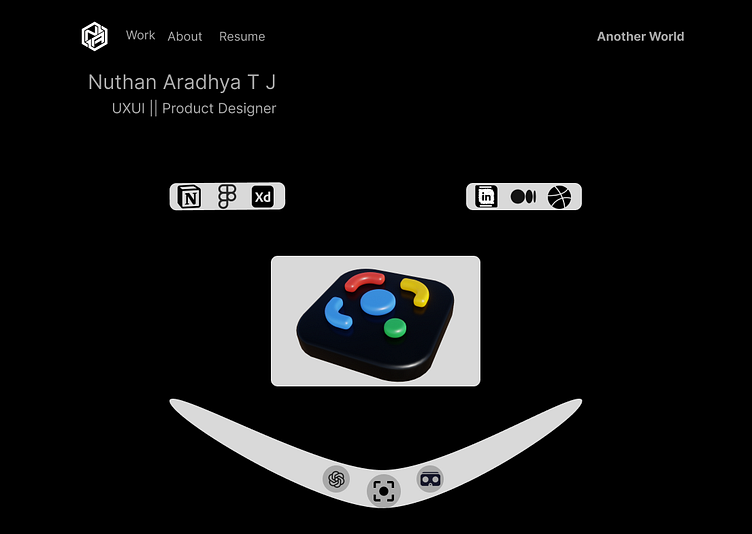
One of the first things that stand out in Nuthan's portfolio is its minimalistic design. The layout is clean and devoid of unnecessary clutter, which keeps the focus on the essential elements: the designer’s name, role, and work. This minimalistic approach not only aligns with modern design trends but also enhances usability. Visitors can easily navigate through the portfolio without feeling overwhelmed, which is crucial in maintaining their interest.
The black background is a bold choice that works exceptionally well in this context. It allows the white text and colorful icons to pop, creating a striking contrast that draws the eye to the most important parts of the page. This is a lesson in how effective color contrast can be in guiding user attention and creating a visually appealing interface.
2. Typography and Hierarchy
Typography plays a pivotal role in UX/UI design, and Nuthan’s portfolio demonstrates a keen understanding of this principle. The font choices are simple and readable, ensuring that the text is accessible to all users. More importantly, the typographic hierarchy is clear: the designer’s name and role are prominent, serving as the focal point of the page. This clear hierarchy guides the user’s journey through the content, ensuring that the most important information is communicated first.
3. Iconography as a Communicative Tool
Icons are more than just decorative elements; they are essential tools for communication in UX/UI design. Nuthan’s portfolio utilizes well-known icons like those for Notion, Figma, Adobe XD, LinkedIn, and Medium, which serve as visual shortcuts to understanding the tools and platforms the designer is proficient in. This not only adds to the portfolio’s functionality but also demonstrates the designer’s versatility and familiarity with industry-standard tools.
The icons are well-integrated into the design, maintaining the portfolio’s clean aesthetic while adding an interactive layer to the user experience. For designers looking to create their own portfolios, this is a great example of how to use iconography effectively without compromising on design simplicity.
4. Adding Depth with 3D Elements
Incorporating 3D elements into web design is a growing trend, and Nuthan’s portfolio does this with finesse. The central 3D icon adds a sense of depth and dimension to the otherwise flat design, making the portfolio more engaging and visually interesting. This element serves as a subtle reminder of the designer’s ability to work with both 2D and 3D design, a valuable skill in the ever-evolving field of product design.
This use of 3D also reflects a modern, forward-thinking approach to design—something that is highly attractive to potential clients and employers who are looking for designers that can push the boundaries of traditional UX/UI.
5. Seamless Navigation
Navigation is a critical aspect of any portfolio, and Nuthan’s design ensures that it is as straightforward as possible. The top navigation bar is simple, with just three sections: Work, About, and Resume. This not only makes it easy for users to find what they’re looking for but also reduces the cognitive load, allowing them to focus on exploring the content.
Additionally, the curved bar with icons at the bottom hints at potential interactive elements or additional functionalities, such as VR experiences. This adds an element of curiosity and invites users to explore further, which is exactly what you want from a portfolio—engagement and exploration.
6. Potential Enhancements: Hover Effects and Responsiveness
While the portfolio is impressive as is, there are always ways to enhance user interaction. Adding subtle hover effects or animations to the icons and buttons could make the design feel even more dynamic and engaging. For instance, a gentle glow or shift in color when hovering over icons could provide feedback to the user, enhancing the overall interactivity of the portfolio.
Moreover, ensuring that the design is fully responsive is crucial in today’s mobile-first world. Although this can’t be assessed from a static image alone, it’s important that the portfolio maintains its visual appeal and usability across different devices and screen sizes.
Conclusion: A Masterclass in Portfolio Design
Nuthan Aradhya T J’s portfolio is a masterclass in modern UX/UI design. It combines minimalism with functionality, creating a user experience that is both aesthetically pleasing and highly usable. From the effective use of typography and iconography to the incorporation of 3D elements and intuitive navigation, every aspect of the design has been carefully considered to reflect the designer’s skills and philosophy.
For aspiring designers looking to create their own portfolios, there’s a lot to learn from this example. Remember, your portfolio is more than just a showcase of your work—it’s a reflection of who you are as a designer. Make sure it’s as thoughtful, polished, and engaging as the work you put into it.