Saas Onboarding
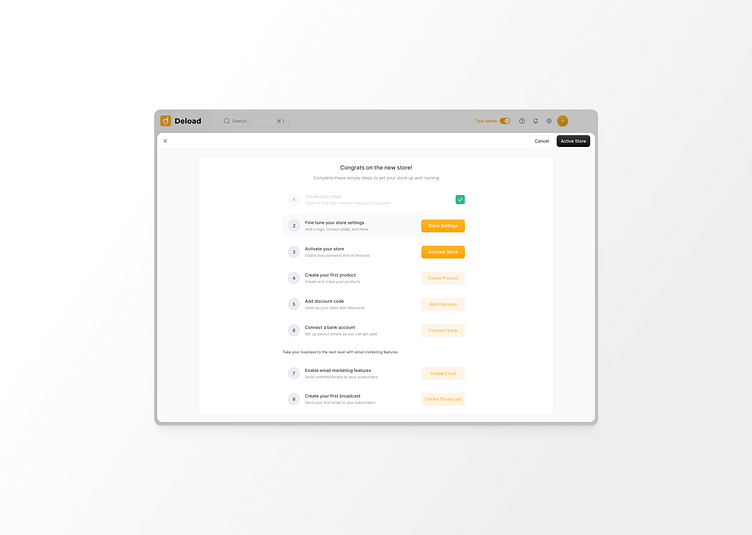
Let’s face it, the first time a user interacts with youre product, they’re secretly hoping it’s not another huge headache. That’s where a smart onboarding walkthrough comes in – like the one you see above. It’s designed to hold your user’s hand just enough to get them started, without making them feel like they need a PhD to figure it out.
This isn’t just a pretty checklist. It’s a well-oriented and friendly, and it breaks down the setup into bite-sized tasks. Each step is clear, actionable, and had a small reward. The buttons lead users smoothly from one task to the next, making sure they don’t get lost in a maze of options.
And because we all love that satisfying feeling of checking things off a list, there’s a progress tracker to keep users motivated. They’ll see exactly where they are and what’s left, which is perfect for those of us who like to know we’re making progress (or just like seeing that green checkmark).
This design is all about making sure your users don’t just reach the finish line – they enjoy the journey. A little bit of guidance, a lot of clarity, and just enough nudging to keep them on track without feeling overwhelmed. It’s like a good friend who’s always there to help, but never overbearing.
In a nutshell, a great onboarding walkthrough turns what could be a frustrating start into a smooth ride. And who doesn’t want their users to feel like onboarding was a breeze? Because if they think setting up was easy, just wait until they start really using your product.
