UX Redesign: Simplifying Scheduling with Clear Guidance
Project Overview: When I moved into a new apartment, I needed to schedule an internet installation through the provider's website. What seemed like a simple task quickly turned into a UX challenge. The original interface was confusing, with unclear instructions, disabled buttons, and visible but unavailable time slots. As a UX/UI designer, I took this opportunity to redesign the interface to create a more intuitive and user-friendly experience.
Challenges Identified:
Lack of Clear Instructions: The original design lacked guidance, leaving users unsure of what steps to take. Input fields were not labeled clearly, leading to confusion.
Disabled 'Next' Button: After selecting a time slot, the 'Next' button remained inactive if any required fields were left blank. This caused frustration as users had no indication of what was missing or why they couldn't proceed.
Visible but Unavailable Time Slots: Unavailable time slots were shown as grayed out in the calendar, which added unnecessary visual noise and could mislead users about their options.
Design Solutions:
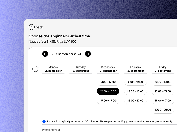
Adding Clear Instructions: To improve user guidance, I added concise instructions at each step. For example, above the calendar, I included the text, "Choose the engineer's arrival time." This immediately informs the user of the task at hand.
Making the 'Confirm' Button Always Active: Instead of keeping the button disabled until all fields were filled, I made it active at all times. If a user attempts to proceed without completing the required fields, an error message is displayed next to the specific field, explaining what needs to be corrected. This approach reduces user confusion and streamlines the process.
Hiding Unavailable Time Slots: To declutter the interface and simplify the decision-making process, I removed the unavailable time slots from view. Now, users only see the times they can actually select, making the experience faster and more intuitive.
Impact and Results:
The redesigned interface is more user-friendly, with clear guidance and a streamlined process. Users can now easily understand what is required of them, choose from available options without confusion, and receive immediate feedback if something is missing.
By making these changes, I aimed to create a smoother, more intuitive user experience that reduces frustration and improves overall satisfaction with the service. The result is a clean, efficient design that makes scheduling an installation as simple as it should be.


