AsthmaPredict - Study App: Elevating the User Experience 💡
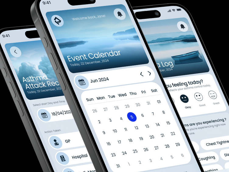
EnterHere’s a closer look at the AsthmaPredict project, where I reimagined the user interface and experience of a mobile app designed to help users predict and monitor asthma attacks. The original version was a minimal viable product, but I wanted to explore how far we could push the design if given more resources.
Login Screen: Simplified and user-friendly, designed to welcome users back with ease.
Event Calendar: A more intuitive approach to tracking daily health events, making it easier to stay on top of asthma management.
Daily Asthma Log: Enhanced to improve user interaction, with clear visuals and a focus on daily health insights.
Visual Identity: Unified the app's look and feel, creating a consistent and calming experience across all screens.
Though these enhancements weren’t implemented, they reflect my commitment to user-centered design and the continuous pursuit of improvement. This is a conceptual redesign inspired by an original project.
Completed project can be seen: https://www.behance.net/gallery/206999655/AsthmaPredict-Enhancing-Mobile-Healthcare-Design
Thank you! 🤍


