BH.Co - architectural bureau | web-site
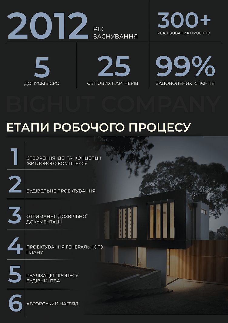
The statistics section beneath the hero image uses a four-column grid, providing a balanced and organized presentation of key company metrics. The grid ensures readability and easy navigation, making it effortless for visitors to digest the information.
Typography & Hierarchy: The use of large numerals for the statistics (e.g., "2012," "300+", "99%") immediately captures attention. Smaller text beneath each figure provides context, creating a clear hierarchy that guides the viewer through the information.
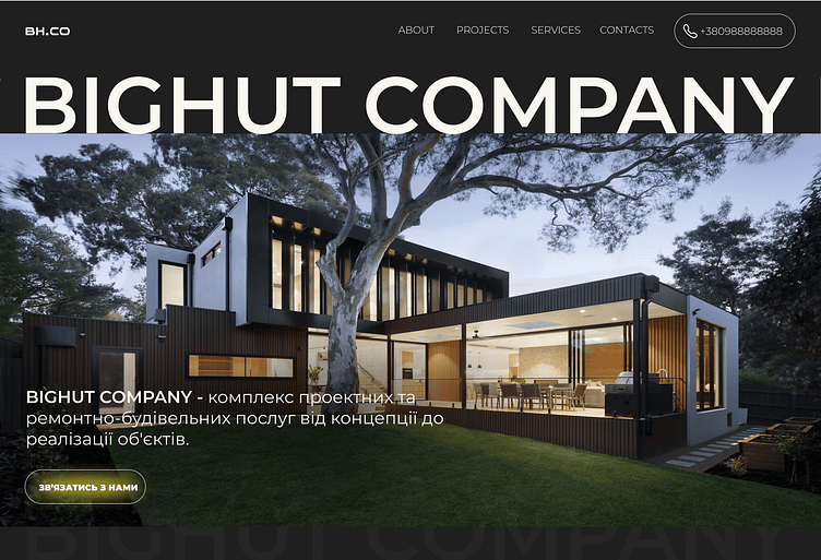
Enter your text here...The design effectively communicates the company's strengths and credibility, using visual elements that are both striking and functional. The balance between image, text, and white space is well-executed, ensuring that the website is not only visually appealing but also easy to navigate and informative. The overall design is poised, professional, and perfectly aligned with the expectations of a high-end construction service provider.
I will be happy to discuss your project - click on "Get in touch"
or use the contacts below - Instagram 🩵 Telegram 🩵 WhatsApp 🩵 darina.web-design@outlook.com
