Beemine Online Store & Branding

Smarter Shopping with Beemine
Experience the Beemine brand, dedicated to smarter, happier shopping. Enjoy personalized deals, innovative tools, and a seamless shopping journey.
Buy. Save. Be happy
This slogan succinctly captures the essence of the brand. It highlights the brand's mission to provide value to customers by helping them save money while ensuring their happiness and satisfaction.
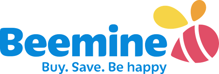
Beemine Branding Concept
The Beemine logo is a well-crafted visual identity that communicates trust, reliability, and happiness. The color scheme is vibrant yet professional, the typography is approachable and modern, and the bee symbol effectively reinforces the brand name. The slogan complements the logo by clearly stating the brand's promise, making the overall design cohesive and compelling. Together, these design elements effectively communicate the brand's values of trust, reliability, and happiness, and its promise to provide value to customers.
Colors
Blue - The predominant color in the "Beemine" text symbolizes trust, reliability, and professionalism. It evokes a sense of calm and security, essential for a brand that aims to help customers save money and be happy with their purchases. The choice of blue in our brand identity reflects our commitment to these values, designed to make our audience feel secure and confident in the Beemine brand.
Yellow - Represents joy, optimism, and energy, which aligns with the brand's goal of making customers happy. It also plays a significant role in reinforcing the brand's name and concept, evoking the image of a bee. Using yellow in our logo will make our audience feel more connected and familiar with the Beemine brand.
Orange - It's the color of creativity, enthusiasm, and warmth, all of which reflect the dynamic and customer-focused nature of our brand. The orange color in our logo plays a significant role in adding a sense of friendliness and approachability, designed to make our audience feel more engaged and valued with the Beemine brand, like a warm embrace.our text here...
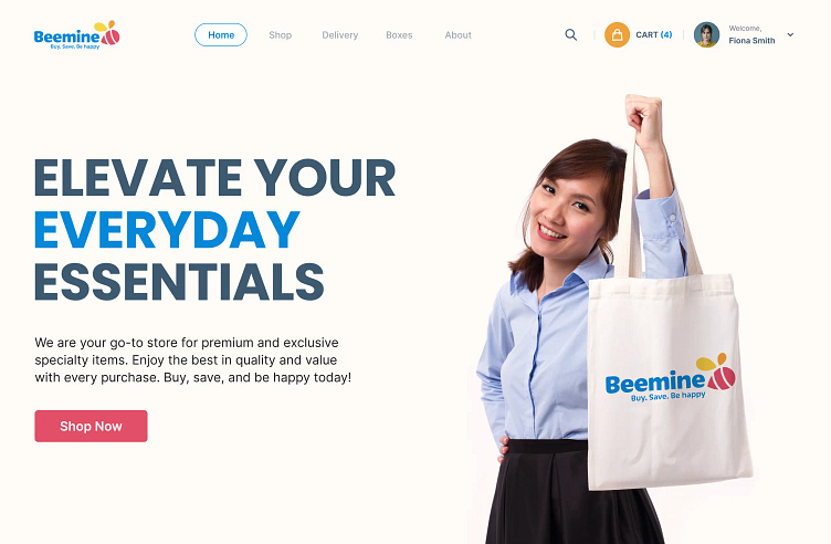
Landing Page
The Beemine logo is a well-crafted visual identity that communicates trust, reliability, and happiness. The color scheme is vibrant yet professional, the typography is approachable and modern, and the bee symbol effectively reinforces the brand name. The slogan complements the logo by clearly stating the brand's promise, making the overall design cohesive and compelling. Together, these design elements effectively communicate the brand's values of trust, reliability, and happiness and its promise to provide value to customers.
The Beemine branding, logo, visual treatment, and landing page all work together seamlessly to engage the target audience, drive conversions, and reinforce the brand's commitment to quality, savings, and customer happiness.
