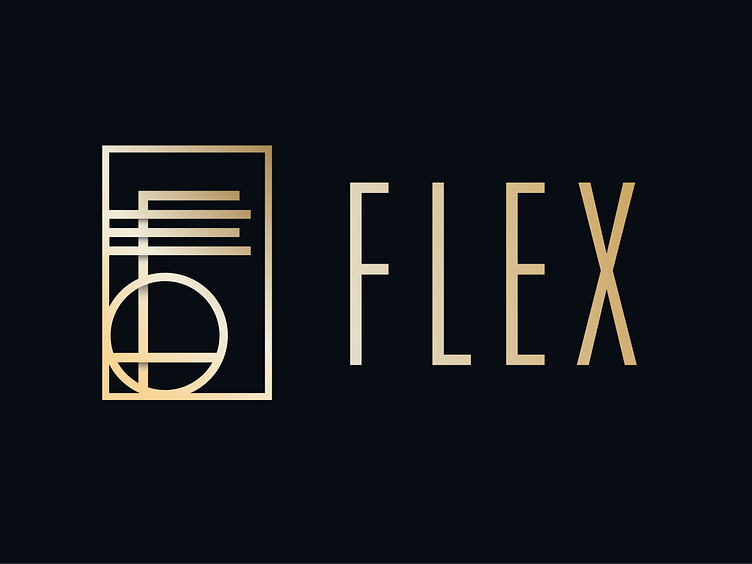
Flex Logo Design
Logo Anatomy
The Flex logo takes an Art Deco design approach, targeting our discerning upper echelon audience and embodying opulence synonymous with wealth and sophistication. This design choice also echoes the aesthetic of the industries we cater to – restaurants, nightlife, theater, and events – and pays homage to their embrace of this style of design and architecture for the last century.
The anatomy of the logo itself conceals the business name, as the letters “F” “L “ E” “X” are subtly hidden within the geometry, while the logo itself appears as an abstract key - a powerful symbol representing our clientele's privileged access to our VIP services, inviting them to unlock exclusive experiences and opportunities.
More by Emma Mccombe View profile
Like


