NOMNOM identity
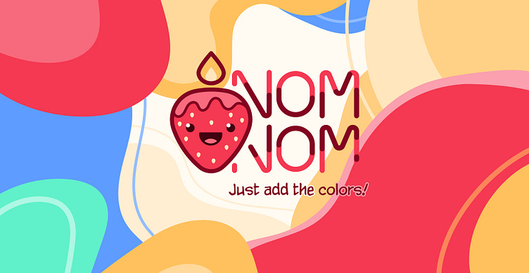
NOM NOM logo consists of graphic and font parts. The graphic part is a stylized image of a mascot. The font part represents illusion of flowing wax. Abstract illustrations used in advertising and packaging also show the illusion of melting colored wax and consist of several colors. The brand’s palette contains of three primary colors: red, yellow, turquoise and two additional ones: blue and white.
Nom Nom logo consists of graphic and font parts. The graphic part is a stylized image of a mascot. The font part represents illusion of flowing wax. Abstract illustrations used in advertising and packaging also show the illusion of melting colored wax and consist of several colors. The brand’s palette contains of three primary colors: red, yellow, turquoise and two additional ones: blue and white.
Candle packaging consists of label design for glass jar and outer cardboard boxes. Top and front box design, the color of the candle change depending on scent of the candle.
Before glass jars, the brand's candles were produced in the shape of various fruit and berries, and the very first of them was strawberry. This is how the mascot was born.
Strawberry Candle is friendly, cheerful and active. It is always on the move, but knows how to rest properly. It prefers balance and harmony. Literally illuminates everything around with its energy and flame on its head. Strawberry Candle acts as a personification of the brand - all managers answer on behalf of Strawberry Candle, which creates a dialogue between the mascot and the audience.


