Letter T, optical illusions, 3D - Logo design, lettering
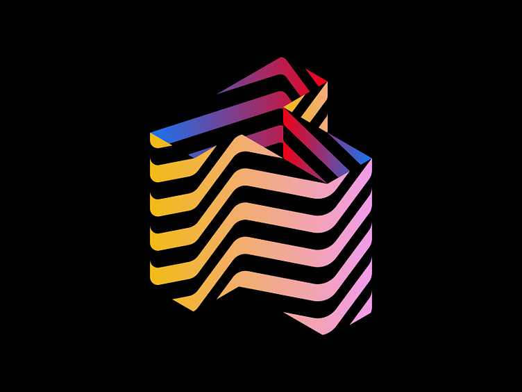
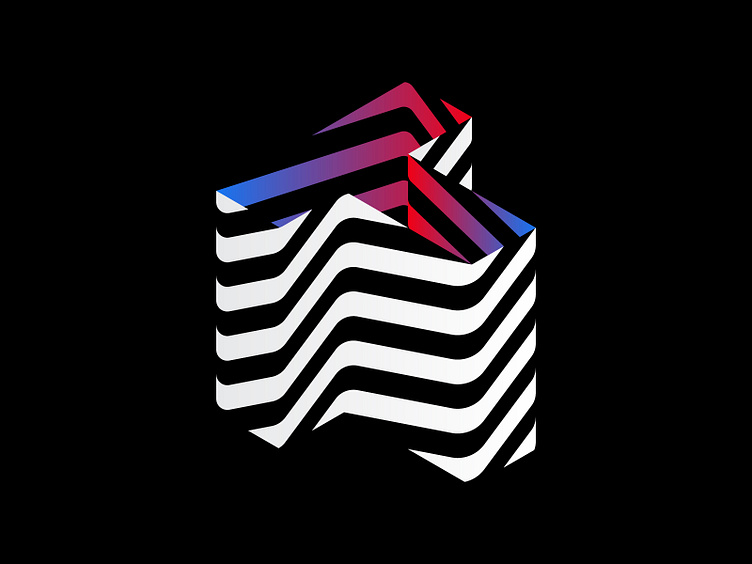
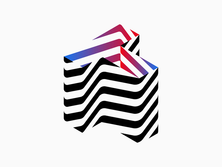
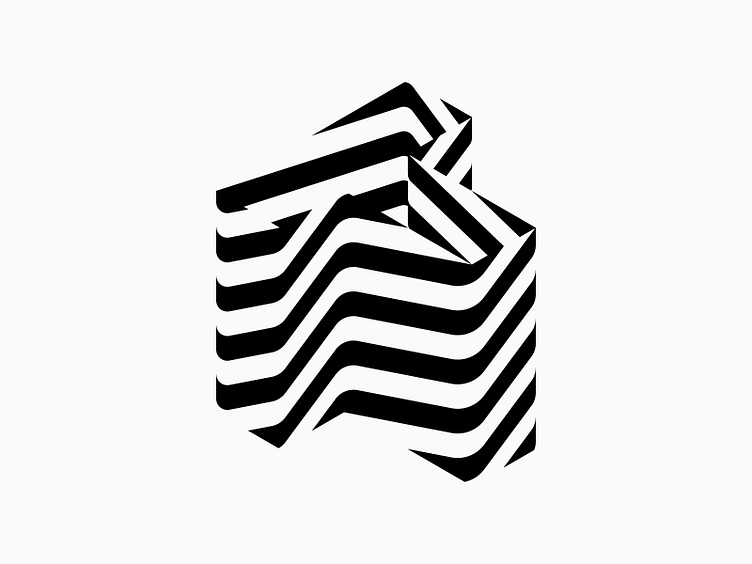
Back to my roots today! I've designed a letter T logo using the style I often used a few years ago. It still incorporates optical illusions and is inspired by MC Escher's work. What do you think? Can you clearly see the letter T with this design style? Any suggestions or advice?