Fintech Investment Dashboard
Case Study: UI/UX Design for FinTech Investment Dashboard
Project Overview
Client: Top Investments Project: Design of a FinTech Investment Dashboard
Objective: To create an intuitive, user-friendly dashboard that enables clients to efficiently manage and track their investment portfolios.
Background
Top Investments is a leading FinTech company specializing in providing investment management services. Their goal is to offer a comprehensive, user-centric platform where clients can oversee their investment portfolios, analyze performance, and make informed decisions.
Problem Statement
Top Investments faced a challenge with their existing investment dashboard. Users reported difficulty in navigating through complex data, understanding performance metrics, and making investment decisions efficiently. The dashboard lacked a cohesive design, which led to a fragmented user experience.
Research and Discovery
User Interviews: Conducted interviews with existing and potential users to understand their needs, pain points, and expectations. Users ranged from novice investors to experienced portfolio managers.
Competitor Analysis: Analyzed top competitors to identify industry standards and best practices in investment dashboard design.
Usability Testing: Evaluated the current dashboard to pain point usability issues and gather feedback on current features and interactions.
Key Findings
Complex Data Presentation: Users struggled with the overwhelming amount of data and charts.
Navigation Issues: Difficulty in finding relevant information quickly.
Lack of Personalization: The existing dashboard did not offer customizable views or relevant notifications.
Design Goals
Simplicity and Clarity: Design a clean, organized interface that simplifies complex data.
Intuitive Navigation: Implement a user-friendly navigation system to access key information with ease.
Personalization: Enable users to customize their dashboard according to their preferences and needs.
Actionable Insights: Provide clear, actionable insights and recommendations based on user data and portfolio performance.
Design Process
Wireframing and Prototyping
Wireframes: Created low-fidelity wireframes to establish the layout and flow of the dashboard.
Prototypes: Developed interactive prototypes to test navigation, data visualization, and key features.
User Interface Design
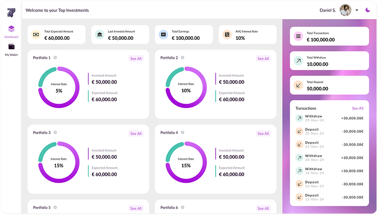
Dashboard Layout: Designed a modular layout with a central overview section, quick-access menus, and detailed data views.
Data Visualization: Utilized charts, graphs, and heatmaps to present performance metrics clearly. Emphasized trends and comparisons.
Color Scheme and Typography: Adopted a professional color scheme with high contrast for readability. Chose modern typography to enhance clarity and user engagement.
User Experience Enhancements
Customizable Widgets: Implemented drag-and-drop widgets allowing users to tailor their dashboard view.
Interactive Elements: Added tooltips, filters, and drill-down options to provide deeper insights without cluttering the main interface.
Notifications and Alerts: Integrated personalized notifications and alerts for significant portfolio changes or market opportunities.
Usability Testing
Conducted several rounds of testing with users to refine interactions, ensure accessibility, and validate design decisions.
Gathered feedback to make iterative improvements and address any remaining issues.
Results
Enhanced User Satisfaction: Users reported a more intuitive and enjoyable experience with the new dashboard.
Improved Efficiency: Clients could navigate the platform more efficiently, accessing key information and making decisions faster.
Increased Engagement: The customizable features and actionable insights led to higher user engagement and satisfaction.
Conclusion
The redesigned investment dashboard for Top Investments successfully addressed the initial pain points by focusing on simplicity, intuitive navigation, and personalization. The project highlights the importance of understanding user needs and leveraging design to create a more effective and engaging investment management tool.
