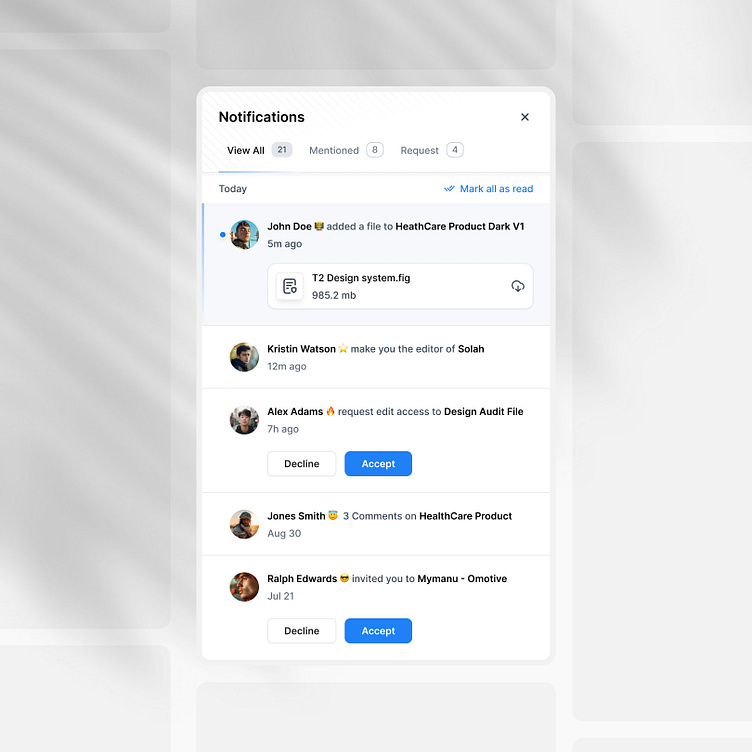
Notifications Modal
Hey Guys 👋
I've created a new Notification Modal design today. I focused on making it user-friendly by keeping the interface simple and ensuring clear UX writing.
Implementing Affordance
While we spend a lot of time learning about UX psychology, we often overlook its importance in our designs.
One crucial aspect of UX psychology is Affordance. It helps users to anticipate what they can do from a specific design or widget without actually interacting with it. Which helps users to save time and make their journey easy and fearless.
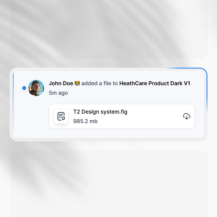
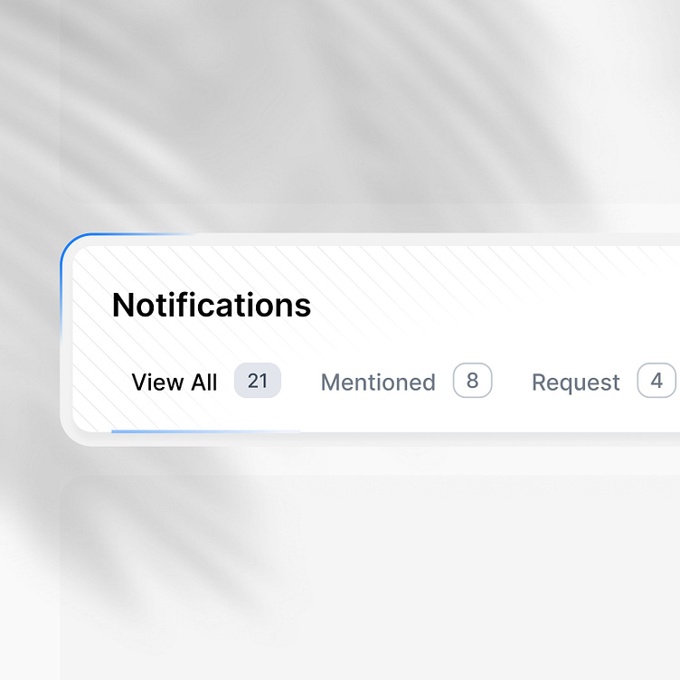
For instance, if we look at the Notification model design, we can easily understand from the tab bar "View all" that there are a total of 21 pieces of information stored. Similarly, without clicking anywhere, we can also understand that there are 8 notifications waiting for us in the "Mentioned" bar and likewise in the request bar. Moreover, when we look at a selected card below the tab bar, we can deduce from the icon that clicking on it will start the download of the document.
By incorporating these small design psychology elements, we can reduce the cognitive load on the user.
Thank you for your attention🙏🏻
Fell free to share your opinion and please consider liking the post
if you liked it ❤️
