Rizze App
The Rizze
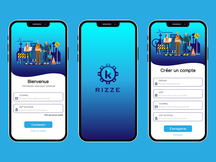
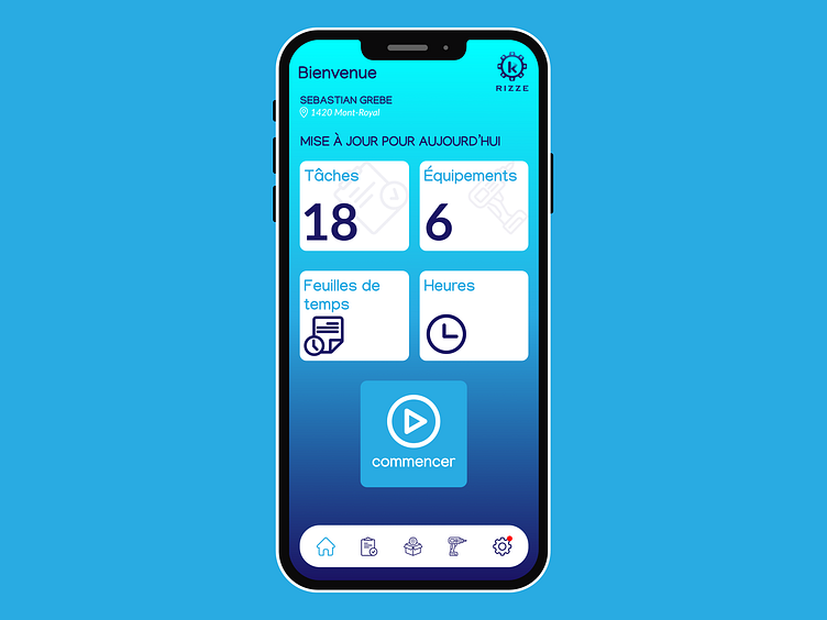
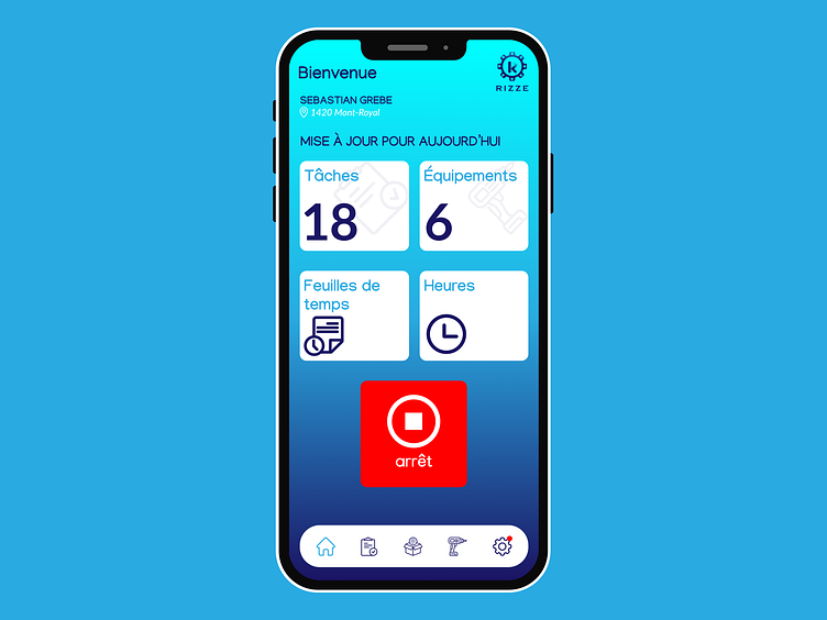
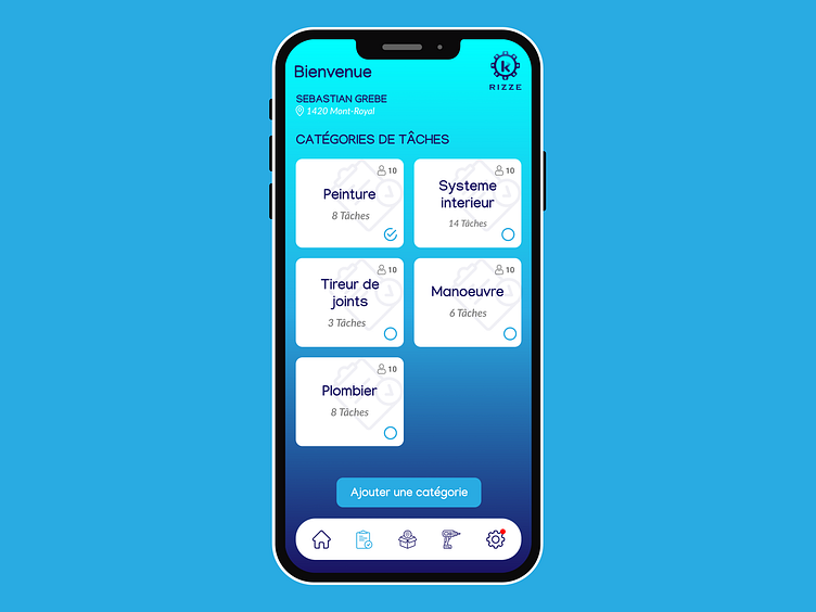
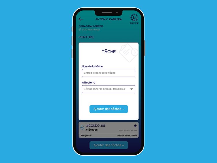
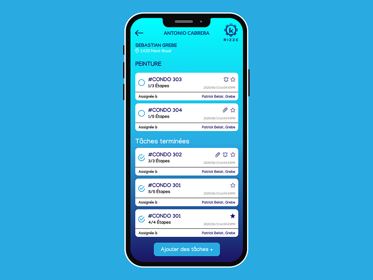
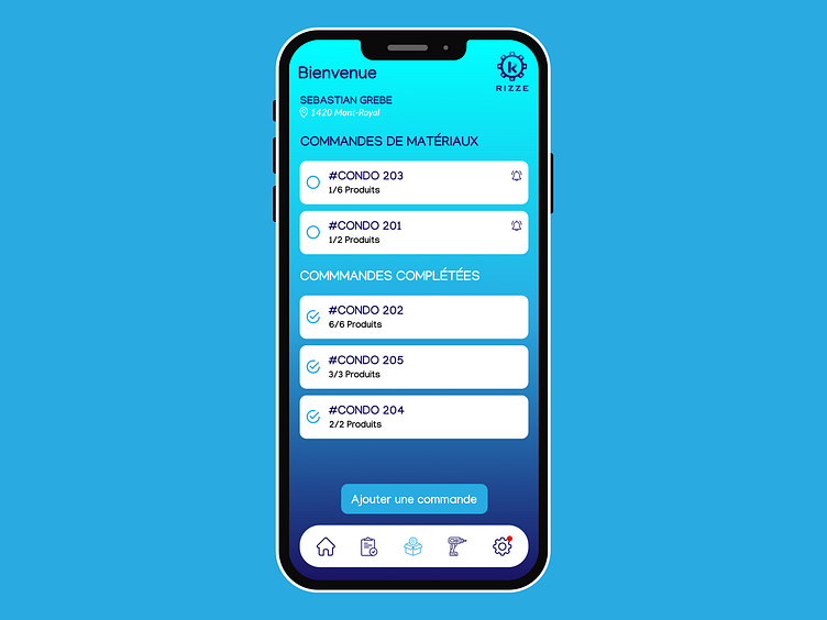
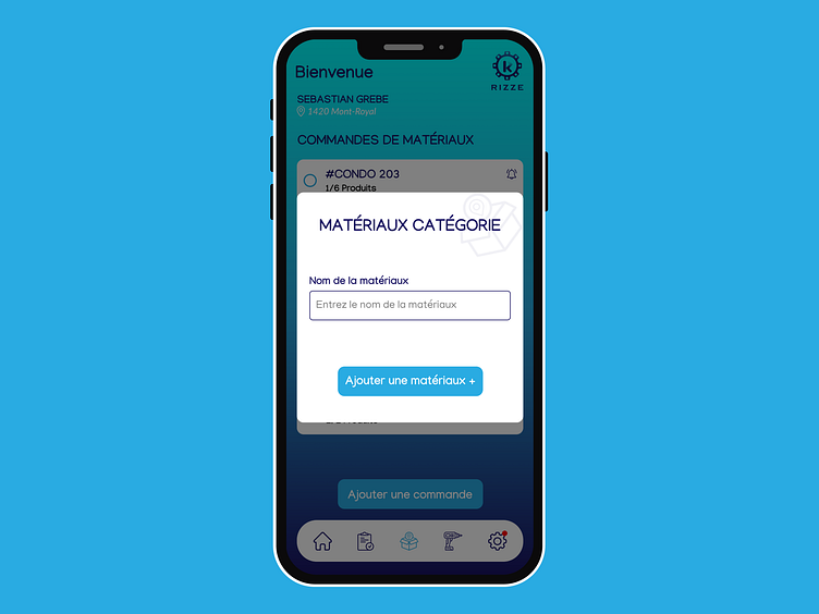
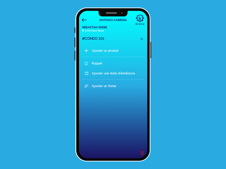
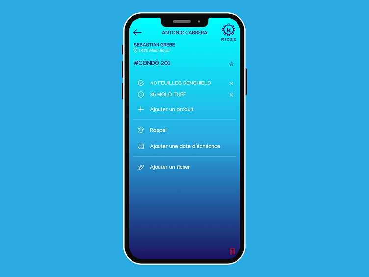
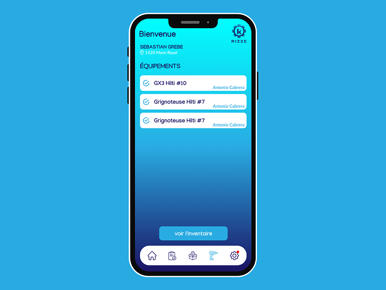
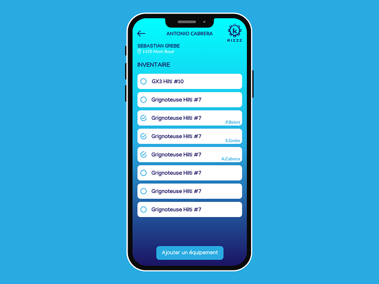
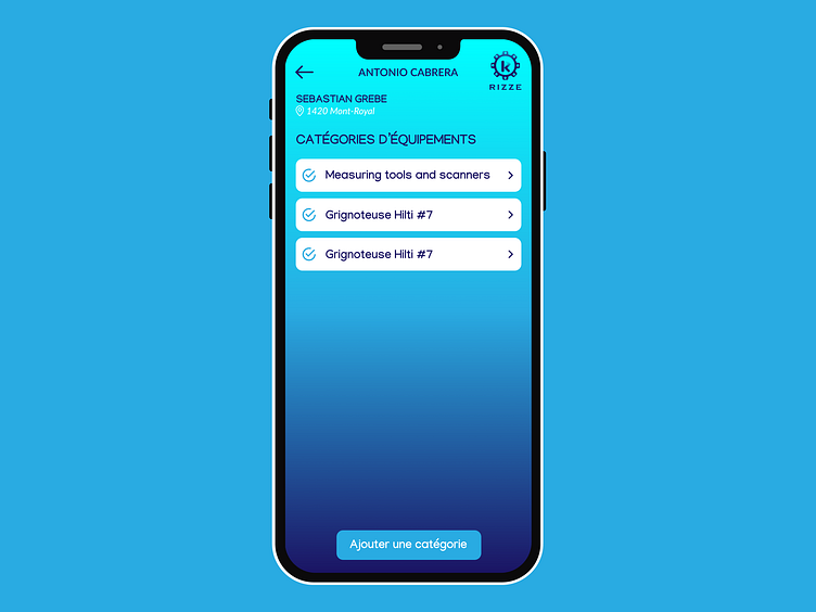
features a Sleek, User-friendly design with a Clean, Modern Interface. We’ve utilised a colour palette that emphasises clarity and usability, ensuring easy navigation and efficient task management. Icons and visuals are crafted for intuitive understanding, while the layout adapts seamlessly to both mobile and web platforms for a cohesive user experience.

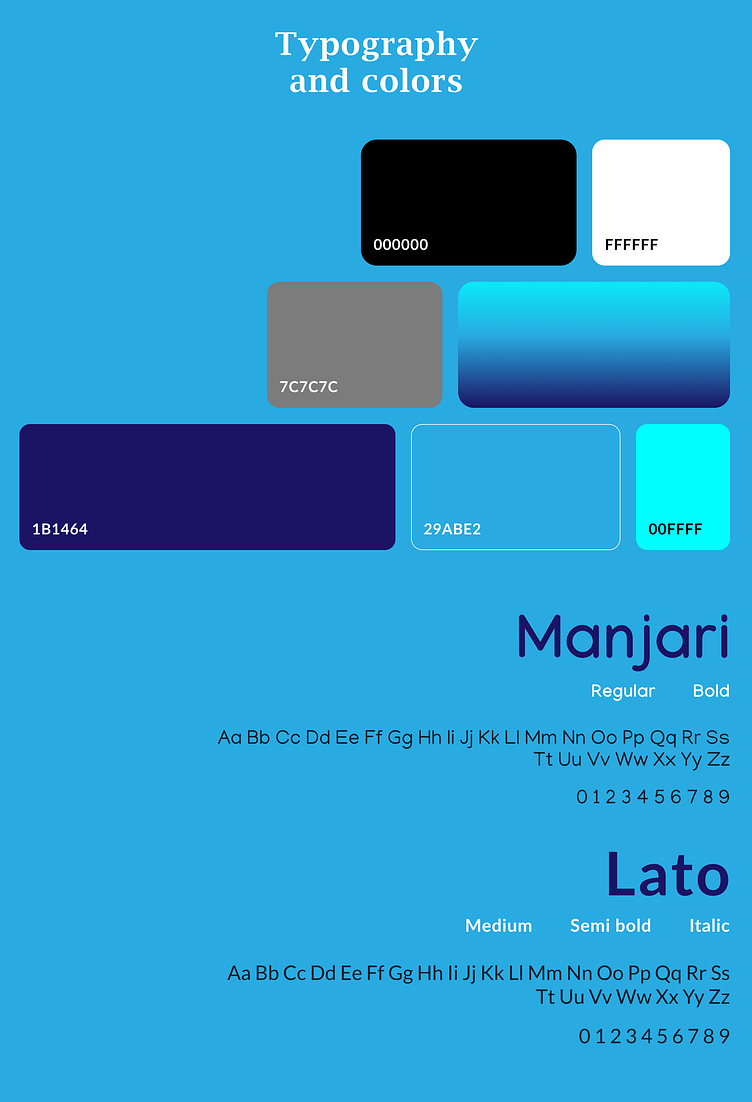
App Colors
Primary Color: A rich, serene tone used for prominent elements like headers and buttons, providing a calming and cohesive look.
Secondary Color: A complementary shade used for accents, highlights, and icons to add depth and contrast.
Neutral Colors: Soft, light hues used for backgrounds and text to ensure clarity and readability without overwhelming the user.
Accent Color: A contrasting or darker tone used for call-to-action buttons and important notifications to grab attention and highlight key features.
This palette maintains a harmonious and visually appealing design while ensuring functional usability.
📞 Contact Us:
We’d love to hear your thoughts and answer any questions you might have! If you appreciate our work and want to get in touch, here’s how you can reach us :
WhatsApp : +91 9998775699
For quick and direct communication, send us a message on WhatsApp. We’re here to provide instant support and discuss your needs.
Email: Contact@netratechnosys.com
Drop us an email for detailed inquiries, project discussions, or support. We aim to respond promptly and assist you with any questions you may have.
Feel free to connect with us anytime. We value your feedback and are committed to delivering exceptional service!
