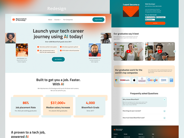
Redesign Bloom Tech Website
Before
Navigation
Clarity: Is the navigation intuitive and easy to understand? Any ambiguous labels or overcrowded menus can confuse users.
Old Layout: The old layout might have had inconsistent font sizes, weights, or styles, making it difficult for users to distinguish between headings, subheadings, and body text.
Cluttered Layout with Poor Spacing: The old design might have had too many elements crammed into a small space, making the page feel overwhelming and hard to navigate.
Misaligned Content: Misaligned text, images, and buttons can make a design look disorganized and unprofessional.
After🔥
Easy Navigate. add modern layout. update spacing. all content is aligned.
Thank you for Watching
Got a project idea? I excel in turning your ideas into striking, concrete outcomes that make an impact. Let's work together to bring your vision to life with accuracy and creativity.
Work Inquiries: 📩 inquiries.araselux@gmail.com | Whatsapp


