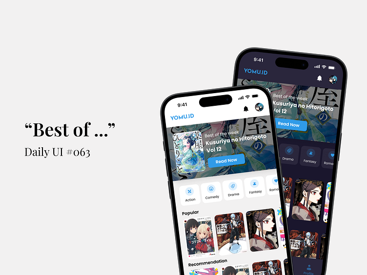
Best of ... - Daily UI #063
🎨 Daily UI #063: Best of the Week Design 🚀
Transforming the way you browse your favorite manga! 📚✨
I just completed Day 63 of the Daily UI challenge, where the task was to design a "Best of the Week" section for a manga reading app. The goal was to create an engaging, visually appealing interface that enhances the user experience.
💡 Dark vs. Light Mode This design explores both dark and light themes to cater to different user preferences. The contrasting styles not only offer visual variety but also ensure readability and comfort in any lighting condition.
🎯 Why It Matters:
User-Centered Design: Every detail, from genre filters to recommendations, is crafted to keep users engaged and make navigation a breeze.
Modern Aesthetic: The clean, minimalist layout aligns with current UI trends, making the app look sleek and professional.
Versatility: Whether you’re a night owl or an early bird, this design adapts to your reading habits.
Let's connect!If you’re looking for a UI Designer who can bring a fresh perspective to your next project, let’s chat! Whether it's a collaboration or a new opportunity, I'm excited to connect with fellow creatives and potential clients. 🤝
------------------------------------------------------------------------------------------------------------
Let's talk and Collaborate:

