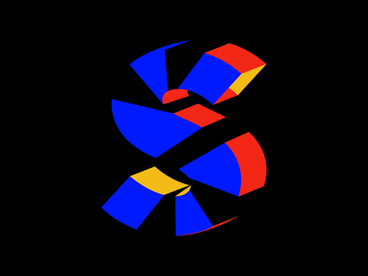
Letter S - Logo design, 3D, Branding, Monogram
Back to daily design practice, trying to design a letter S with the same style as my previous post. This one was a bit trickier because I had to divide it into 11 parts instead of my initial plan of 9. Readability-wise, 11 parts seemed to work better. Not sure how you guys feel about this S design, does it look ordinary or interesting?
More by Satriyo Atmojo View profile
Like


