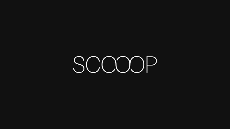
"Scooop" Ice Cream Logo
SCOOOP!! For this logo, I kept the font weight light and creatively merged the three "O's" in the name. To me, the three "O's" evoke the image of three scoops of ice cream—though that might just be my imagination! :)
More by Jonah Welsh View profile
Like
