Design Elements of the Restaurant Booking Service | Mobile App
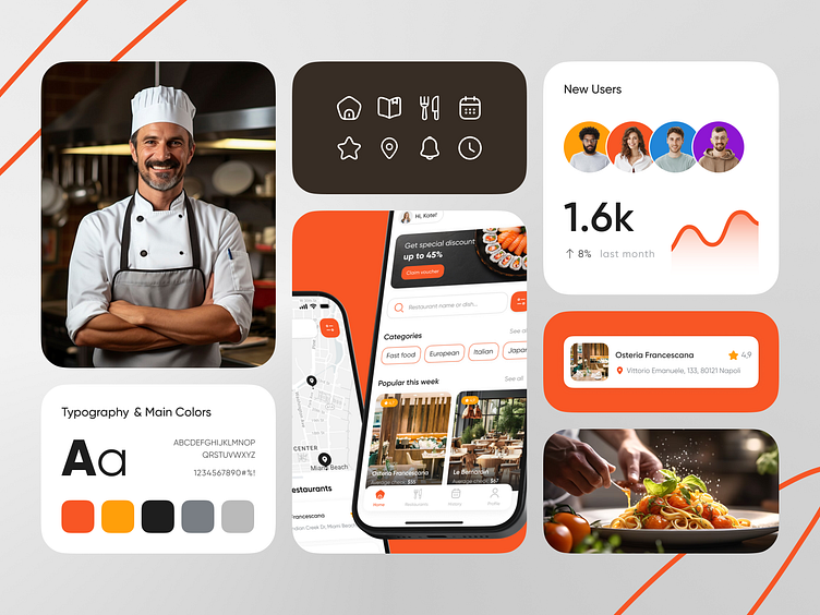
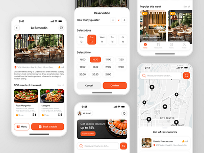
We developed a booking service that creates a visually appealing and functional interface. The color scheme, which includes orange, yellow, black, light gray, and dark gray, sets a bright tone. Orange and yellow bring warmth and energy, which is ideal for stimulating appetite and creating a welcoming atmosphere. Black, used for text or accent elements, adds contrast, while different shades of gray create a neutral background, making color elements stand out without overwhelming the user.
The minimalist visuals prioritize ease of use. Customized icons add a unique touch, reinforcing the app's branding and making navigation intuitive.
From a UX perspective, the Restaurant app is designed for seamless interaction. Users can browse restaurants, check menus, make reservations, and place orders with minimal effort. The interface uses contrasting colors to naturally direct the user's gaze, ensuring that essential actions are easily recognized.
The booking service balances aesthetic appeal and usability, ensuring that users have a great experience from opening the app to making the final reservation or order.
If you liked this shot, don't forget to hit the ❤️!