Rebranding a company's website
When designing the website for a corporate entity in the real estate or construction industry, my goal was to create a professional and modern online presence that reflects the brand’s expertise and reliability.
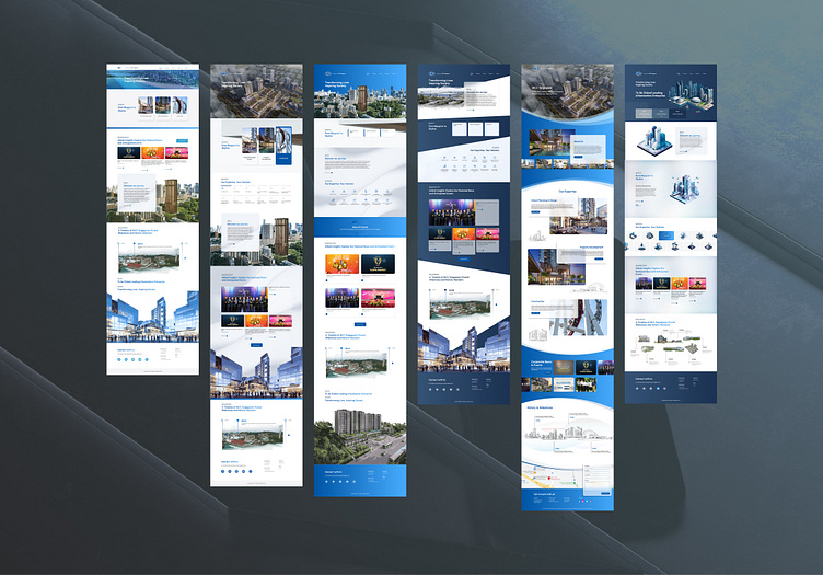
I explored various themes, starting with a clean and minimalistic design focused on simplicity and easy navigation, ideal for clients who prefer a straightforward approach. I then moved to a more visually impactful theme, incorporating high-resolution images and urban landscapes to tell a compelling visual story.
Next, I experimented with a darker, more refined color palette to evoke elegance and sophistication, catering to high-profile clients who value luxury.
Finally, I explored a dynamic, forward-thinking theme with bold geometric shapes, aiming to highlight the brand's innovative edge. Each iteration was a step towards finding the perfect balance between aesthetics and functionality, ensuring the website not only looked impressive but also delivered a seamless user experience.
Style 01
Style 02
Style 03
Style 04
Style 05
Style 06


