Boxem - Direction 2
Boxem Direction 2
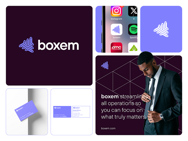
For Boxem, an app that helps you more effectively run your online Amazon dropshipping business, I created this direction to figure out how to show their visual identity as it relates to their place in the world, the market, and their ideal customers.
This light, unsaturated blue felt right as the main color used for brand recognition for such a product and market due to how it paired/contrasted with another main color, namely the very, very dark magenta/pink color. This color palette is pretty cool! Which is exactly what Daniel DeFeo, founder of Boxem, wanted. Try it out on a future project and let me know what you think.
As far as the logo is concerned, what started out as a logo utilizing a cube/box shape eventually turned into a visually interesting way to show the idea of business owners shipping their products to others all across the world. It is somewhat of a complex logo, but it still works well due to it working well in one color. Remember to always start out your logo explorations using one color! This will ensure a functional logo later down the road. If you want to bring even more visual interest to a logo through the use of gradients, textures, etc. for certain marketing campaigns, then that is fine, but like I said make sure to do that afterwards.
Does this direction hit the spot for you?
Need a proper brand identity?
Contact me: hello@patricktuell.com or at patricktuell.com
#logo #logodesign #logodesigner #brand #branding #visualidentity #design #graphicdesign #graphicdesigner #freelance #freelancer #designagency #minimal #simple #clean #abstract #bento #grid #layout #print #printdesign #digital #digitaldesign #app #appicon #product #productdesign #digitalproduct #amazon #amazonseller #dropshipping
