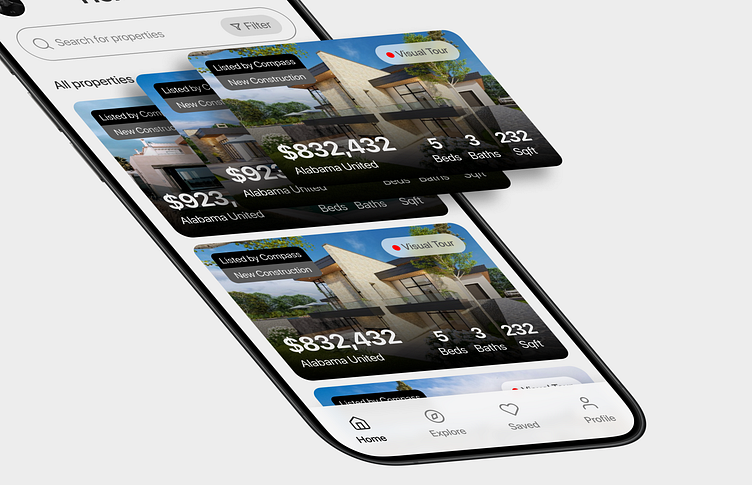
Real estate mobile app home screen
Problem:
I found out that people find it hard to use real estate apps when the home screen is too busy or confusing, making it tough to make a decision and quickly find what they're looking for.
It's a big decision to rent or buy a property, and the process sometimes can be frustrating why add to that frustration digitally?
Solution:
I designed a simple and user-friendly home screen for a real estate app that displays, filters and sorts properties, making it easy to navigate and find what you need.
Timothy Exodus (TimX Design)
Designing products for brands that cannot afford to fail ⚡
Get in touch
More by Timothy Exodus (TimX Design) View profile
Services by Timothy Exodus (TimX Design)
Like


