One Medical Redesign (Daily UI Challenge #3)

Project Type: Passion Project / Personal Practice
Disclaimer: This redesign is not affiliated with or commissioned by Amazon. It was created solely as a personal project to practice my design skills and enhance my design eye.
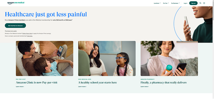
Below is the current One Medical hero space before the redesign.
Motivation for Redesign
While exploring the One Medical website, I noticed that the cycling, animated text representing the various medical issues One Medical can address was placed beneath the hero section. This dynamic feature is incredibly eye-catching, and I believe it deserves more prominence on the page.
Changes
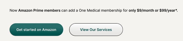
To improve the user experience, I repositioned this animation as the centerpiece of the hero section. This adjustment ensures that users are immediately engaged by the full scope of services One Medical offers.
I added a secondary button, "View Our Services," next to the "Get Started on Amazon" button. This allows users to quickly access detailed information about the services provided by One Medical or immediately begin the sign-up process. By offering both options upfront, the page becomes more intuitive and user-friendly.
Parting Thoughts
The original hero section felt somewhat outdated and lacked the inviting, engaging feel that One Medical's services deserve. By making these adjustments, the page now conveys a more modern, welcoming, and dynamic first impression. This redesign maintains the integrity of the original layout while enhancing its effectiveness in drawing users in and guiding them through the user journey.