Website Redesign - Newsela Case Study
Newsela Website Case Study
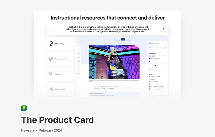
For prospective users, the product card is a key element in the Newsela interface, but functionally, it presented several issues. It doesn’t fully communicate the platform's efficiency or the use cases of several features. I created an interactive prototype along with a case study to illustrate an alternative to their current approach. This is 1 of 2 case studies I made for Newsela, working directly with Co-Founder Dan Cogan-Drew to revamp their products utilizing my youth perspective.
The Problem
The product card is an essential portion of Newsela’s website as an interactive way to learn more about the product. However, the message and website features aren’t communicated clearly. Could we redesign the card to leverage the short-attention span of new users to communicate the ease-of-use of the product?
My Role
After analyzing the habits of younger students around me, I wanted to find a way to incorporate the new craze of short form content to advertising. Through user research and competitive analysis with similar companies, I created an interactive high fidelity prototype of an alternative landing page to present the product.


